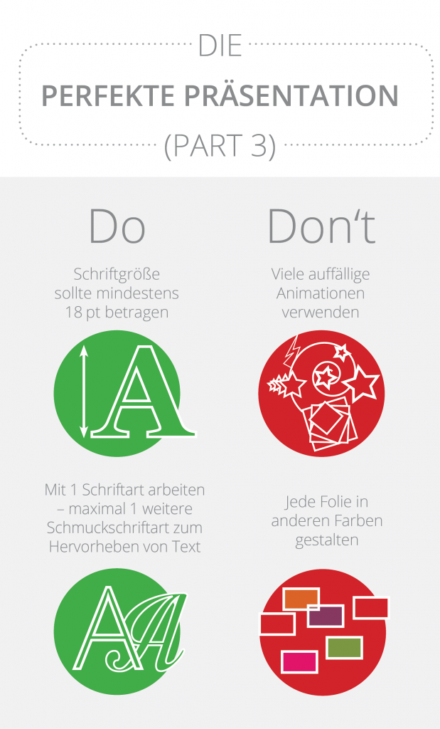
The third installment of our mini infographic series on " The Perfect Presentation " has been released. This latest infographic offers tips and tricks for designing a presentation, as well as two negative examples. You'll learn about the optimal font size , the best font to use, and what to avoid when designing a slide.
For example, while it's a good idea to add an animation to a slide, as this brings more dynamism to the presentation, it's a definite no-go to cram too many animations onto a single slide. Less is definitely more here. Opt for a single, but impactful animation – the more subtle the effects, the better.