

In the second part on the correct use of (Excel) tables in PowerPoint ( Part 1 ) you can expect:
2) Design your table attractively
3) Working in tables
4) Animation of tables
5) Further information on tables
2) Design your table attractively
You can customize the design of your table in many different ways. PowerPoint already offers a fairly large selection of ready-made design templates by default.
Select the table you created. A menu will open via Table Tools/Design, where you can define the basic design.

This is quick and easy, and you'll end up with a visually appealing image. The next image shows four examples, a small selection from the template table.

WARNING: At the very bottom of the table, there is a button labeled "Delete table". This is completely misleading, as the table is NOT DELETED, only the formatting is reset!
In some cases it is appealing to fill the areas with gradient colors, but depending on the color choice, the readability of the text may suffer.
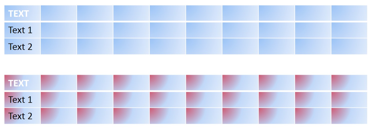
TIP: Unfortunately, you can't select a gradient that covers the entire table. But you can use a workaround. Remove all fill from the cells and select > Table Tools/Design > Shading > Table Background > No Fill . Then insert a > Shape > Rectangle , which you can design however you like. Afterward , right-click this shape and select > Send to Back to move it behind the table. Three examples:

Similar to the editing options in Excel, PowerPoint also offers many ways to graphically modify individual text or cells.
A) Two cells were connected
B) Three cells were merged, text was right-aligned, and the attributes were changed.
C) You can select and change multiple cells at once
D) It is irrelevant whether it is a heading.
E) You can also change the column width or the size of a cell individually.
F) Of course, it is possible to customize the color of individual cells.
G) For large cells, choosing a 3D design can be very appealing.
H) Note that the normal settings for modifying a shape do not apply here. Instead, you must select a design via > Table Tools/Design > Table Effects > Bevel , and unfortunately, you do not have as many options for modification as you normally would with shapes.

TIP: If you make a significant mistake when designing many cells after some time, it is sometimes better to restore the table to its original state using the table styles, rather than tediously changing many small settings manually.
The use of 3D designs of any kind requires careful consideration. On the one hand, they are not as easily varied in table mode as with standard shapes. On the other hand, a table can quickly become cluttered and difficult to read. The image on the left shows a standard table without borders, then one with slightly wider white borders, and on the right, one with an additional 3D representation.

If you've worked with tables in PowerPoint before, you've probably tried out the various options and gained experience. While editing cells is easy, editing borders can be quite challenging.
The layout of the border lines can be determined quite flexibly (left). By default, a table created in PowerPoint is always initially built (as shown on the right), meaning your table uses white border lines.

ATTENTION: There is a fundamental difference between the border/cell lines and the grid lines. Have you heard about this?
> Table tools/Layout > Show gridlines: If this is activated, then the gridlines will ONLY be displayed in editing mode. 
The frame or cell lines, however, are visible in both editing and presentation modes and are also printed.
Working with border lines is somewhat unusual. For example, you won't immediately find a button that completely changes the borders to a different color.
A) In this table, > No border has been selected, therefore you do not see a line.
B) This table is almost identical to the first. However, it is highlighted, and gridlines are displayed to make filling in the cells easier.
C) In this table, individual border lines have been assigned different colors. However, changing these lines requires the reverse of conventional methods: FIRST you must determine/select the (pen) color, thickness, and type of line, and THEN click on the corresponding line.

D) Following the same procedure, first select a pen color to change the color of all the border lines. The mouse pointer will change to a pen. You could – as shown in C) – now change the color of individual border lines. But now press ESC and then select the table again.
If you now click > All border lines , the entire border appearance will change. This procedure takes some getting used to at first. Especially if you deviate from the standard in border details, you will need to experiment a bit.

NOTE: When selecting > All borders , it is important to consider which cell is currently selected, where the cursor is located, or whether the entire table border is activated. Therefore, "All borders" can mean:
- All lines around a cell,
- all lines around multiple cells,
- a complete column or row or
- The complete table, including all intermediate lines.
It's easy to make a mistake here. As is so often the case, "practice makes perfect".
Of course, you can apply the mirroring effect to a table in all sorts of variations. But be careful, the result only looks right at first glance!
The next image shows a table with different mirroring settings. Whether mirroring a table is actually useful is something you'll have to decide based on your corporate identity and how it interacts with other graphics in your presentation.

But do you notice anything? Yes, of course, the text is missing in the mirrored version. Only the graphical table is mirrored. In some cases this might be sufficient, but it's obviously better if the text content is also displayed.
TIP : However, with a trick you can still achieve a true reflection here.
A) Here you see another table filled with text, which was inserted from Excel and mirrored. The text is missing. Select and copy the table.
B) The (Excel) table has now been inserted as an image from the clipboard. If you select a mirrored effect via > Picture Tools/Format > Picture Effects > Mirroring > Half Mirroring with Touch, the text will also be displayed.
C) Next, place this image behind the inserted, non-mirrored Excel table. If you change any text, remember to insert the new table again as an image so that the cell contents of the mirrored image match the actual table contents.
D) TIP: When mirroring an image, a white border always appears at the bottom, meaning the reflection has a gap from the actual table. Crop your image precisely to the edge, and the reflection will align perfectly with the bottom of the table.

The advantage is that the mirroring is actually displayed with all content, and you can still use the table as an "Excel table" (as shown in the blog post Tables Part 1).
Another tip : If your cells don't have a colored fill, the underlying photo might still show through in detail. In that case, fill the cells with a very light shade, and the coverage will be perfect.
Add a photo to the fills and table background
In exceptional cases, it makes sense to insert a photo or graphic as a background. Be careful not to use overly busy or busy content, as viewers can often barely see the text or content of the cells in such cases.
Often, photos are inserted, yet the result is still unsatisfactory. One reason for this could be working too quickly or carelessly, and confusing the selection between "cell fill" and "table background."

A) In the first example you see a table where the slide background has been filled with gray.
B) An image (here the PresentationLoad logo) was inserted via > Table Tools/Design > Fill . However, you still see the gray fill, even though, or rather precisely because, the logo (see the very bottom of the image) has a transparent background. (A blue rectangle has been placed behind all the images for clarity.)
C) The display will only be correct again when you select > Table Tools/Design > Table Background > White as the color.
D) You can further optimize the background of the graphic. Select the table. Right-click > Format Shape > Increase the transparency , for example to 75%. This will make the text easier to read.

Note that the "slide background" selection (shown in grey in A) really refers to this entire background (regardless of individual fills of selected cells).
E) Two cells have been selected with the mouse. A new color (light blue) has been defined via > Table Tools/Design > Shading .
F) Of course, you can also change individual cells this way. Note: It is not possible to exclude individual cells from the overall slide background.
As this example also shows, the identical proportions of the inserted graphic and the cell size play a crucial role. If these do not match, the photo will be distorted – in the example above, the logo was particularly compressed in width.
To illustrate this problem even better, take a look at the next image.
A) The starting point is again the table with a grey background.
B) Then, as described above, the fills were personalized with the logo. Additionally, the logo was inserted via Table Tools/Design > Shading > Table Background > Image from the hard drive. Both images overlap. Since the logo (see below) has a transparent background, this is easily possible.
C) This is how the correct presentation looks. The logo is inserted in the table background, the cells have no fill, and the logo extends across the entire table.
D) If you were to select a fill for the cells again now, the logo's text would no longer be visible. This means that the cell fills are positioned over the slide background (with the logo)! As the name suggests: Slide BACKGROUND.
E) If you want the logo in the background AND a colored fill for the cells, then set > Format Shape > Fill > Transparency (50%).

Nevertheless, the display remains questionable, as the text in the cell may be difficult to read. This example also shows that the rendering of the slide background plays a particularly important role when working with white text in the cells.
If you want to work with colorful photos, the limitations of the display and readability quickly become apparent.
A) In this table, a color photograph has been inserted into each cell. Naturally, it is distorted accordingly.
B) Here, the identical photo is placed in the background of the slide. However, it is again displayed distorted.
C) TIP: If you don't have a suitable photo that reflects the proportions of the table, you'll need to use a little trick. Insert the original photo from your hard drive and resize it so that the most important part of the photo is roughly centered in the table and shows the image's characteristics. Then crop your photo to fit the exact size of the table. Place it behind the table – done.
D) You can easily change the photo's colors using standard image editing tools. For example, displaying this image in grayscale works very well. This will give the cells a harmonious, uniform appearance. You'll notice that this design makes the text even more legible.

Similar to the process for mirroring, you can also add a shadow to your table. Here are a few examples that you can customize or modify.
A) You can achieve this display using > Table Tools/Design > Table Effects > Shadow > Offset diagonally bottom right .
B) By right-clicking > Format Shape > Shadow, you can adjust the shadow in great detail, just as you would with shapes. Here, the blur area has been set to a larger size (40pt), giving the impression that the table is floating even "higher".
C) If you want the table to appear slightly "raised," then place the shadow completely in the center and the table will look more three-dimensional. (Blur 15pt)
D) However, you must use these settings carefully, as excessive application can look illogical and incorrect (Inward Center, Blur 40pt). The choice of shadow depends heavily on the size of your cells and the amount of text.

3) Working in tables
The use of color in a table is very important for its perception. It often happens that you have (almost) finished creating a table and suddenly not only do content changes need to be incorporated, but the number of columns or rows also changes.
In this case, you have a fairly extensive range of options via table tools/layout, which should be sufficient for most requirements.

The buttons in the layout ribbon are self-explanatory. However, some features do require explanatory notes.
When working with tables, it's often not easy to select a column, a row, or the entire table. The arrow on the left side of the ribbon helps with this.
A) Simply click anywhere in the table with your mouse pointer. The arrow will then be activated (see C).
B) If you click exactly on the edge of the table, the arrow is usually not selectable and is displayed in gray.
C) When activated, the arrow has a black border and the text is clearly legible. You now have the three options shown: selecting the table, a column, or a row. With a little practice, this is a very quick way.

The "Delete Table" button is interesting. Clicking it doesn't immediately delete the table; instead, you're given the option to delete a column, a row, or the entire table. This differs from the "Delete Table" button in the "Table Styles" menu at the bottom, which only resets the attributes. The other options for deleting columns and rows are straightforward. 
The "Split Cells" button is unusual and rarely used. Clicking it opens a small menu where you can select the number of columns and rows. 
A) Simply click in a cell. The button will be automatically activated, and you can then select the number of columns and cells.
B) After clicking OK in the menu, the cell is immediately split according to your specifications. Here, 5 columns and 4 rows.
C) Nevertheless, this example also demonstrates a possible application. Two cells were selected simultaneously using the mouse. The settings were "1 column" and "4 rows". This allows you to quickly create subcategories within a single row. Note: If you select multiple cells, the menu settings will apply to each individual cell.

The familiar buttons for moving objects between layers are not specifically related to tables here. However, additional objects or text are often placed alongside tables. Having these buttons directly in the (table) ribbon allows for better overall workflow and easier control of the various objects. 
4) Animation of tables
Unfortunately, by default, tables can only be animated as a "whole", meaning the entire table with all its contents and respective attributes moves accordingly.
The next example shows three variations:
A) Swipe from the left.
B) Wheel effect with one spoke.
C) Rotation. The last two options are certainly unsuitable for business use, but they illustrate the problem. It's better to make the table appear with a simple effect than to choose unusual or spectacular animations.

For simple tables, this might certainly suffice, allowing you to display the entire overview at once. However, for extensive table content or longer explanations of individual fields, it's more practical to use animations to explicitly highlight specific facts.
Unfortunately, since PowerPoint version 2007, it's no longer possible to animate individual cells within a table separately. When explaining a specific concept related to a single cell, the eye can quickly tire and easily wander to other numbers. However, you can use a workaround to arrive at a solution. Unfortunately, this method involves disabling the entire table.
A) Select the table and copy it to the clipboard. On the ribbon , go to Home > Paste, select Paste Special > Picture (Extended Metafile) , and paste the table image back onto the slide. With the table still selected, choose Ungroup . A menu will appear asking whether you want to convert the graphic to a drawing object.
B) Confirm with "Yes" and you will initially see no change. However, it is now a group in which all individual cells are combined. Right-click and select > Grouping > Ungroup .
C) After this action, all elements of the table can be selected individually and animated individually.

TIP: Note that when a table is automatically created, there is also an area for the slide background, which also exists as a separate object. If you leave all elements selected and want to animate them immediately, the background will also be affected by an effect.
The next image shows possible animations with the individual cells.
A) All fields appear simultaneously with the swipe effect.
B) In this version, only the fields in the first row are animated.
C) Similarly, you can animate each cell individually as desired.

Remember that you can group columns, rows, or different cells and animate them separately to highlight common issues.
TIP: If this is too complicated or time-consuming for you, and you only want to highlight individual lines, there is another simple trick.
Duplicate your table on additional slides and color a different row on each slide. In presentation mode, simply advance through your slides one after the other, and the viewer will have the impression that only a different row is being highlighted each time.
A) On the first slide, the first line is highlighted in color.
B) Here you can see an overview of all slides. On each slide, a different/the next line is highlighted.
C) Accordingly, the first slide looks like this.

This approach is of course also possible when displaying columns or different individual cells (groups of cells).
Often it's better not to color the cell itself separately, but to mark the cell with a border. For example, you might want to highlight several facts and show their relationships. In that case, you can use the workaround shown above.
A) Three slides are marked on the left in the overview.
B) This is what the first slide looks like.
C) The following slides only contain frames or arrows to indicate specific facts.
D) When switching from slide C) to D), it looks as if only the red borders change, since the table remains unchanged.
E) This is what the third representation of the table looks like in slide size.

TIP: Insert your table on the slide master. This allows you to set up many slides with all kinds of markers without constantly having to interact with the table. An original idea: Switch between slides using the > (slide) transition > rotate . It will appear as if the markers are swung in from the right.

As the slide transitions to the next slide, these two markers rotate further to the left, while the markers for the next slide appear from the right. The table remains perfectly still in the background, and the movement is impressive.
5) Further information on tables
- Excel spreadsheets can quickly become very large due to the number of rows and columns. Aside from the fact that such tables become virtually unreadable, PowerPoint also has internal limitations. It's better to work with multiple tables – otherwise, the overview suffers.
- If an Excel or Word table was embedded in your presentation (at some point) and these OFFICE applications do not currently exist on your computer, then you will not be able to edit these tables in the specialist applications.
- If you copy a table from PowerPoint to Word, the table background will not be displayed because this function does not exist in Word.
- Cell borders cannot be edited/modified using the standard shapes.
- Once you have changed individual border lines, the automatic functions of the table styles will still apply, but all your detailed settings will no longer exist.
We hope you enjoy trying it out!