PowerPoint Layout: Tips & Tricks Plus 6 Modern Ideas for Your Slide Layout!
A well-designed PowerPoint layout is essential for any presentation. Why? Simple: a visually interesting and coherent slide grabs your audience’s attention and makes you and your content look professional.
A good PowerPoint layout creates a common thread running through your presentation by coordinating design elements. This allows your audience to easily follow the content of your presentations without getting distracted, meaning your ideas come across clearly and you can deliver your message effectively.
Creating a PowerPoint layout is easy, and allows you to customize your presentations to best effect. In this article, we show you which aspects you need to pay attention to in order to guarantee a good slide layout.
PowerPoint Layouts: What exactly do they involve?
A PowerPoint layout basically contains important formatting, placeholders and positioning for your slide content. Using these guidelines, you can easily build a great presentation, inserting the images, text, and charts you need to persuade the audience of your ideas.
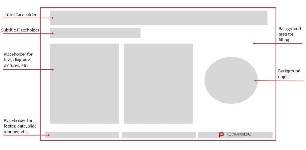
PowerPoint slide layouts pull together the design elements which are so important to a coordinated presentation: colors, fonts, backgrounds and effects are preset for you. They can of course be modified individually once you’ve decided on your layout, but setting them leaves you time to concentrate on the content you want to present, rather than fiddling with design. Here is an example of the design elements which might make up a slide:
Why use a PowerPoint Layout? The advantages
PowerPoint layouts help you build a presentation quickly and easily with preset placeholders, designs and positioning. Because the elements of your slides are already coordinated, you don’t have spend time trying to make your slides look uniformly professional, attempting to line up content perfectly, or messing about trying to balance different elements.
A PowerPoint layout means one thing above else: saving you time. And that‘s a huge advantage: the time you save can now be used to concentrate on the actual content of your presentation.
What’s more, using a preset slide layout makes you look professional. Your slides are coordinated throughout, letting your audience follow the thread of your arguments without getting distracted.
PowerPoint layouts can be really eye-catching, too. Preset designs up the visual impact of your presentations, but allow you to make individual modifications when needed, guaranteeing brand recognition value. Read more about how to do this below!
Creating PowerPoint Layout: Here’s how!
- Open Microsoft PowerPoint.
- Click Start, then in the Slides group, select Layout.

3. A window will open with a selection of slide layouts.
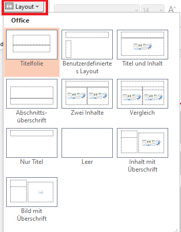
4. Choose the template which best suits your needs; you can use it as it is or change individual elements (see below).
Modifying a Preset PowerPoint Layout
So you like the layout you’ve chosen, but want to customize it by changing some of the elements? No problem. This is where the Slide Master function in PowerPoint comes in:
1. Select Slide Master in the View tab.
2. When the thumbnail area pops up, select the slide that comes closest to the layout you want.
(Tip: If you don’t like any of the layouts on offer, select Blank and make up your own layout with placeholders, etc. We’ve set out how to do this in the chapter “Nothing in the preset options appeals? Just create your own personal PowerPoint layout!” below.)
3. To change the layout, just read on:
Adding a Placeholder
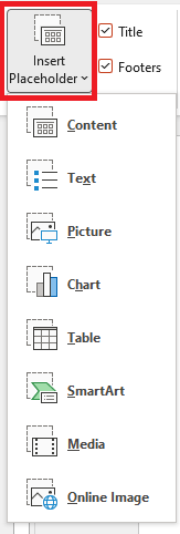
Simply click Insert Placeholder in the Slide Master tab. Select the type of placeholder you want. Then decide where you want to put it on the layout, and drag the cursor to insert the placeholder.

Resizing a Placeholder
Select the slide on which you want to change the placeholder in the View tab in Slide Master, then click the placeholder. Click on a corner and drag (the cursor will change to a crossed arrow) until the placeholder is the size you want.
Changing a Placeholder’s Position
To move a placeholder, hover the cursor over it. Once the cursor changes to the double arrow, just click and drag to the right place.
Deleting a Placeholder
To remove a placeholder, select Slide Master in the View tab, and click on the slide containing the placeholder you want to remove. Select the placeholder in the layout and then press delete.
Rotating a Placeholder
Click on the placeholder; an arrow curving round in a circle will appear at the top. Just click on that and drag it round to rotate the element any way you want.
Bring particular elements into the foreground, or send them to the background
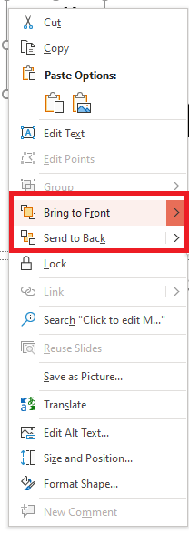
Right-click on the element you want to highlight or mute, and a drop-down menu will open. Select either Bring to Front or Send to Back, and save.
When you’ve made the changes you want, click Close Master View in the Slide Master tab.

- In Normal view, in the Thumbnails pane, select all the slides you’ve just revised. (To select multiple slides, hold down Ctrl and click to select the slides you want.)
- Next, select Layout from the Home tab and select the layout containing the placeholders you just changed. This step finalizes the placeholder change by re-inserting the changed slide layout onto a final edited slide.
Duplicating a PowerPoint Layout
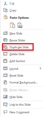
Once you’ve got a slide layout exactly to your liking, it’s easy to duplicate it so that you can use the same layout on multiple slides. This also applies to preset slide layouts, of course. Here’s how: In the View tab, click on the Normal option:

- An overview of all your slides will now appear on the left. Right-click the slide whose layout you want to duplicate.
- Then select Duplicate Slide in the menu that opens. A slide with an identical layout will appear.
Nothing in the Preset Options Appeals? Just create Your Own Personal PowerPoint Layout!
So you already know that using the preset slide layouts saves time and allows you to modify where needed, you really don’t like any of the preset slide layouts. No worries – you can create a custom layout that’s exactly what you need in just a few steps:
- Open Microsoft PowerPoint.
- Select Slide Master in the View tab.
- Slides with suggested layouts will now appear on the left.
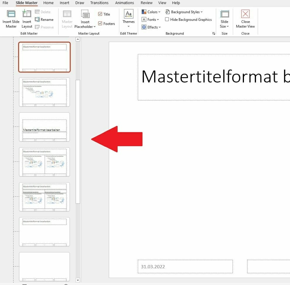
- Right-click on any of the options (don’t worry about it not being what you want; you can change what you need later) and select Insert Layout, or click on Insert Layout from the menu at the top.
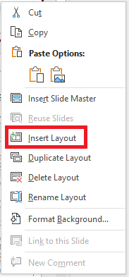

- Renaming the layout helps you to keep track and to find it later. To do this, right-click it again and select Rename Layout, then type in the new name.

- Now you can start editing. Delete all the preset placeholders if you don’t want them, or leave some in and edit them (see above) – it’s up to you.
- Insert the placeholders you want for your layout using the Insert Placeholders option. You can choose text, content, chart, or other layouts in the drop-down menu. After selecting a layout, drag the placeholder to the position you need. You can rotate it, resize it and edit it as shown in the paragraph “Modifying a preset PowerPoint layout” above.
- Done with your editing? Then close the master view – select Close Master View in the Slide Master tab under Close.
- Now save and close your presentation.
- When you open the presentation again, you can now search for your personalized layout – select the New Slide option from the Start menu under Slides. Just search for your renamed PowerPoint layout in the selection that opens..
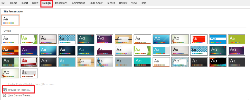
Tip: If you want to use your layout in an existing presentation, you have to make a small detour. Open the relevant presentation and select the Browse for Designs option in the Design tab. You will find this under Designs when you open the drop-down menu to the right of the selection (see screenshot).

Save Your Personalized PowerPoint Layout as a Template!
Saving your layout as a template makes it really easy to use in future presentations. Here’s how:
- While in the layout, go to the File tab. This will take you to the PowerPoint start menu.
- Select Save As.

- Find your template in C:\Users\<your username>\Documents\Custom Office templates.
- Select the file type PowerPoint Template and save.
Next time you open PowerPoint, you can use your template by clicking New when you open PowerPoint, selecting Custom Office Templates, and clicking on Create once you’ve selected your individualized PowerPoint template.
Professional Design for Your Slide Layout: 6 PowerPoint Layout Ideas that will make Your Presentation a Real Eye-Catcher!
Persuading your audience of your ideas, so achieving your goals, and really standing out with your presentation, is so much easier with an excellent layout. We’ve put together six professionally designed and effective PowerPoint layout ideas for you, illustrated with reference pictures of slides we’ve designed for clients:
1. PowerPoint Layouts for Title Slides
Every presentation needs a title slide. Since this slide is always the first slide you present, and so the first slide that your audience sees – often as soon as they enter the presentation room – you need to design this slide for maximum impact.
In 2022, the trend for title slides is toward large-format images. When selecting your background image, be sure to choose one that will appeal to your audience right from the get-go. For example, go for a theme related to your topic or business. In this example, the steering wheel motif is appropriate for the automotive group GG:

Using large-format images doesn‘t mean missing out on a powerful headline. This needs to stand out.
So either use an area of your image that is neutral, or opt for modern overlays or transparent designs. With the latter you bring some color into play, so you need to adjust the contrast to the background image to make your headline stand out effectively. Here are some examples:


Using overlays or transparent design allows you to create just the slide you need. You can use color gradients (see the GG Group title slide above), whole areas (see the Uni Per slide) or shapes (below). How you compose the slide that’s right for your presentation is completely up to you.

2. PowerPoint Layouts for Agenda Slides
Your agenda slide reflects the content of your presentation and so it’s important to get it right. Info and tips about these in PowerPoint can be found in this article.
Looking for professional templates? We’ve a whole range in our store.
Agenda slide layouts can either be structured traditionally as a tabulated list, or presented as a process. Large-format images can make an impact here, too. You can use them either in portrait format or as a complete background. It‘s important to leave enough space to get your agenda points over. You can also use a grid as a guide for agenda layouts. To do this, take a look at the slide below. Here you see a three-part grid: 1/3 space for the agenda items, 2/3 space for the picture. (Or, for agendas with more points, in reverse (i.e. 1/3 image and 2/3 agenda).

There’s also the option of a quad grid, as below:
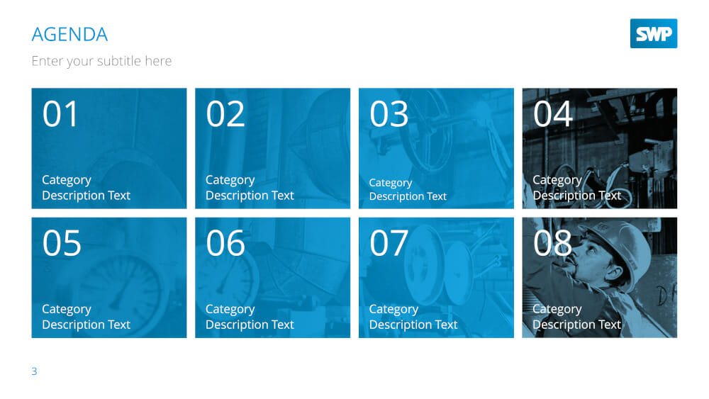
This shows eight equally sized image boxes, going from left to right, in two rows. Obviously, you can customize the background image and layout to your exact needs.
3. PowerPoint Layouts for Slides combining Images and Text
Layouts for image-text combinations are especially important in the body of your presentation. These can include bulleted lists, product presentations or even portfolios. What’s important here is how image and text interact within the slide.
One classic layout which works well is an image with your text underneath. An interesting modern variant on this is to put several images alongside each other, as below:
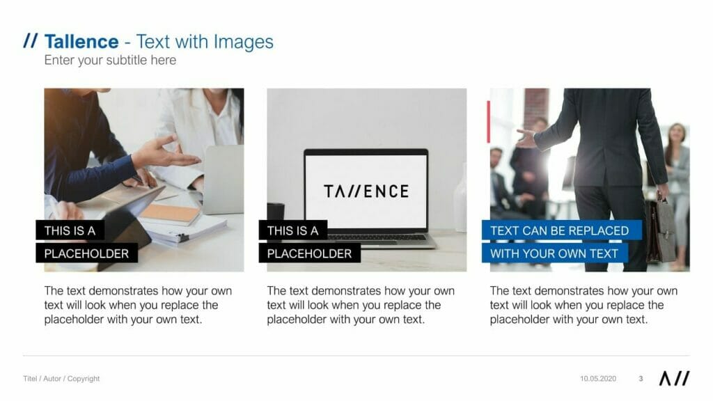
Using large-format images can be really fresh and impactful. For example:
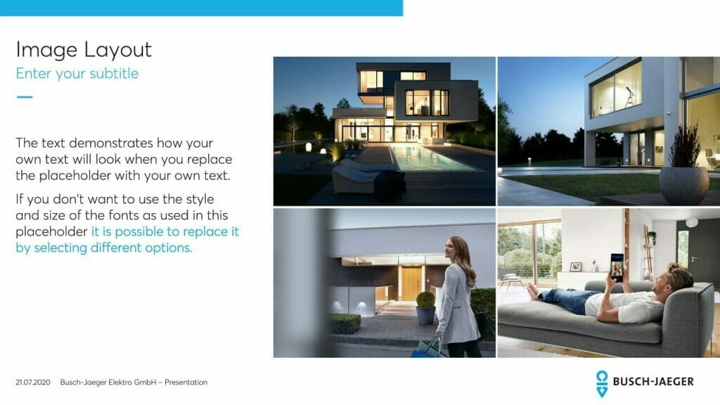
You can also use a grid as a guide for image-text combinations. In general, this works best with a three, four or five images. Using more than that means your slide will look cluttered and your content will be difficult to read.

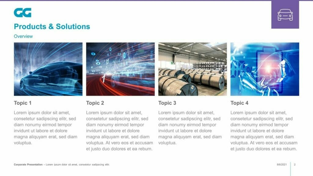

4. PowerPoint Layouts for a Combination of Icons and Text
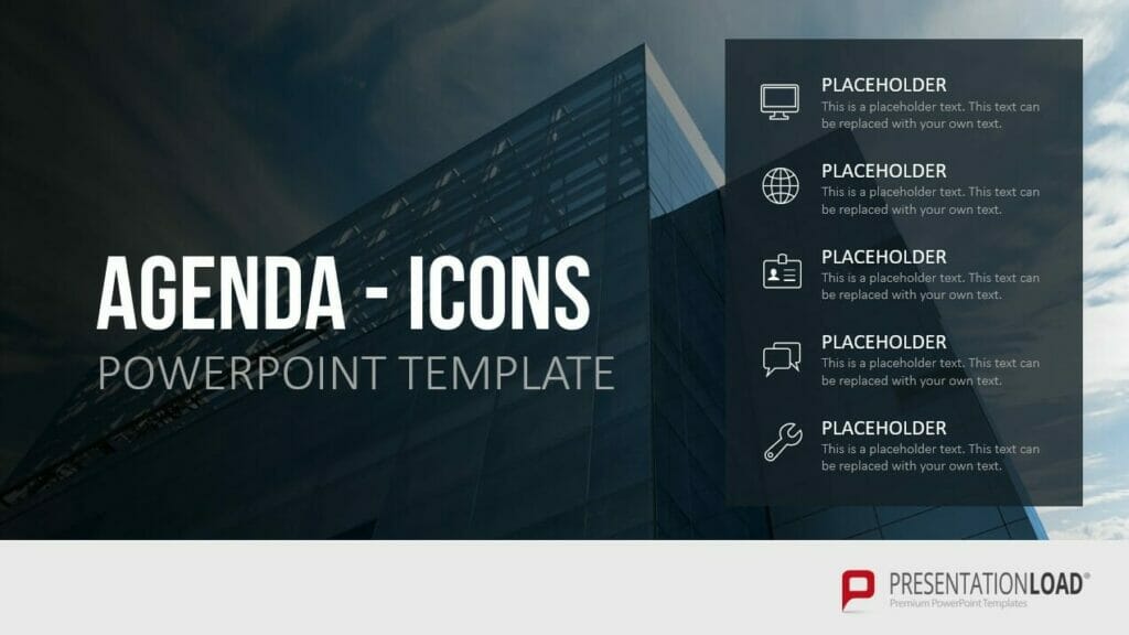
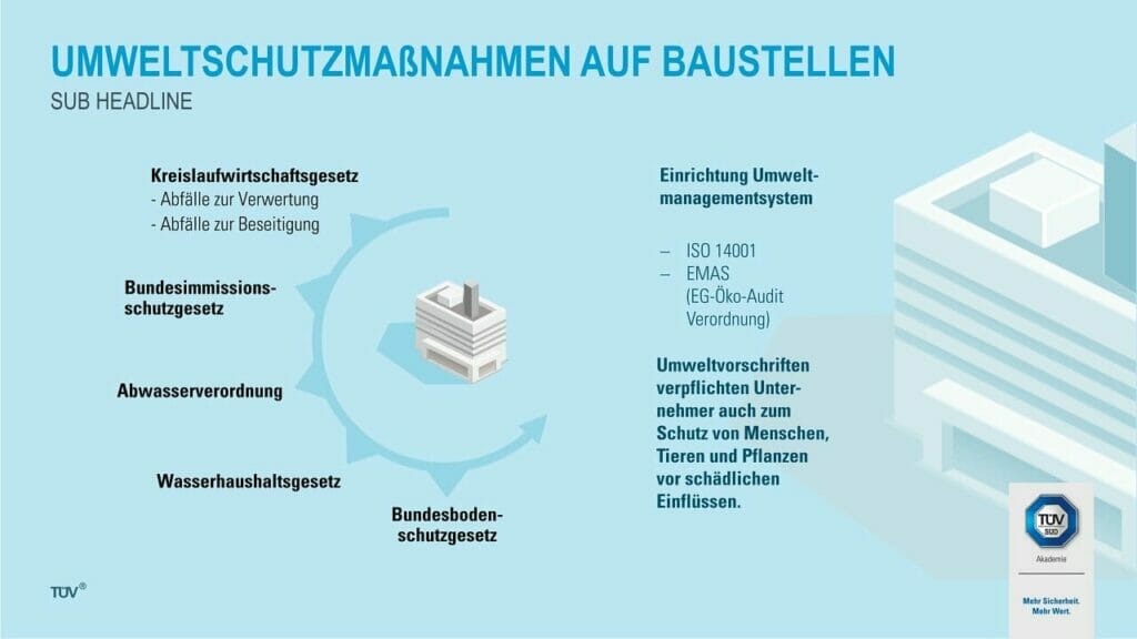
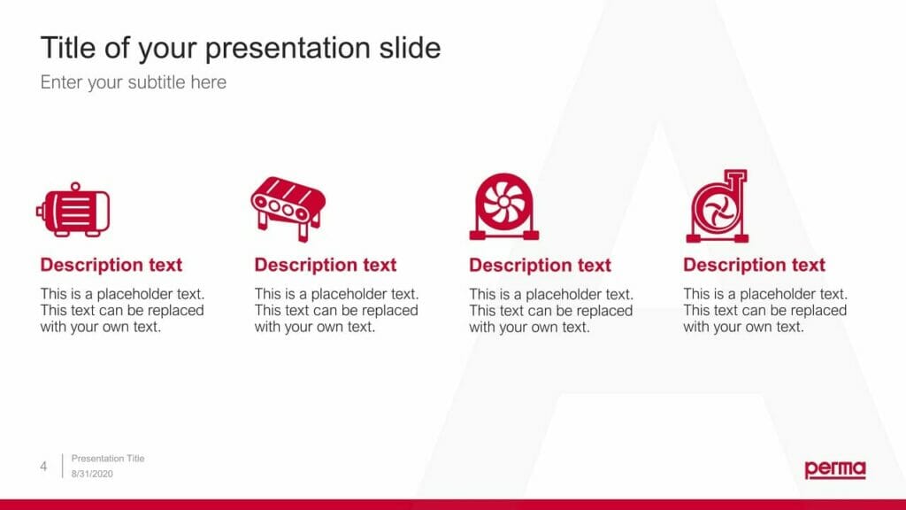
Icons are a great way to illustrate complex content in a simple way. They also add impact to your presentation and are visually interesting. We offer a wide selection of icon templates in our store. Here are a couple of examples:
In general, layouts combining icons and text work well with layouts similar to those used in image-text combinations. PowerPoint lets you place icons in gridded or non-gridded combinations, with their text by them. Here are some examples:


5. PowerPoint Layouts for Lists
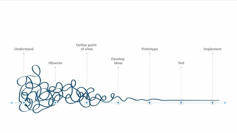
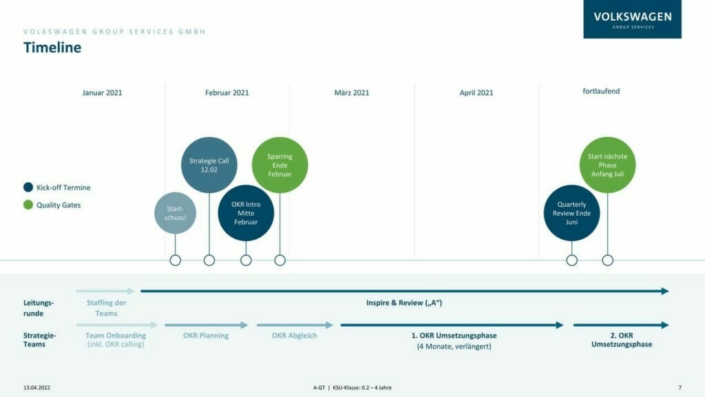
When you want to present lists of items, bullet points are of course the classic choice, but increasingly people are choosing to visualize them as a process form, right up-to-date and attention-grabbing. The layout below, visualizing the process from left to right, makes your list easily comprehensible.
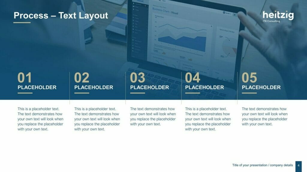
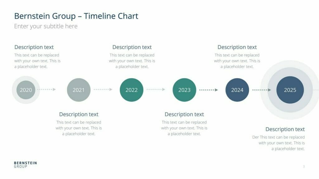
For this type of layout, use the entire width of the slide for maximum impact.
You can also make great use of a circular form; more and more people are moving away from the old rectangular box.

6. Further Options for Image/Text Layouts
We’ve already covered image-text layouts above, but here are a few more ideas to make your presentations get noticed.
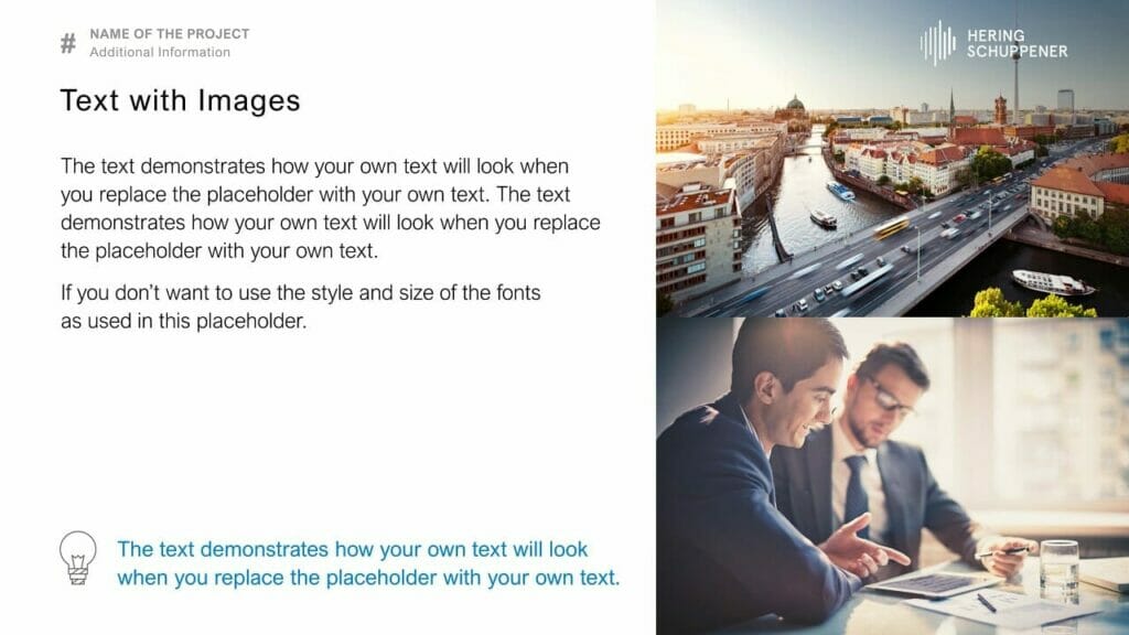
Option 1: Text on the left, image on the right
This option is a classic layout, as it works with the fact that English is read from left to right. So your audience grasps the content first, then it’s reinforced by the image. This also makes your text easier to read, as the lines are shorter.
Option 2: Image on the left, text on the right

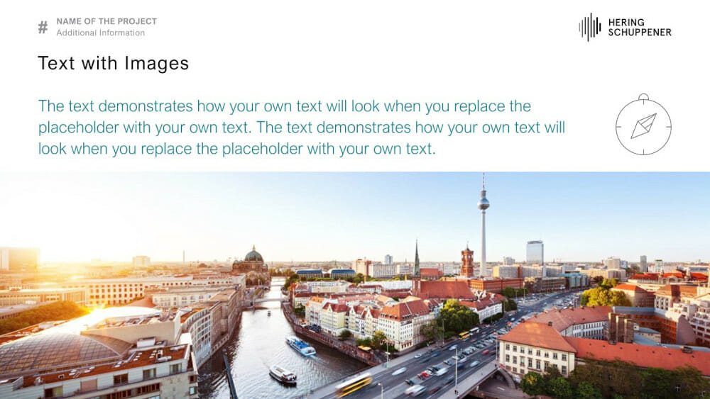
Option 3: Text above, large-scale image below
Option 4: Full-format image, with overlays
You’ve seen above how much of an impact this can make with title slides, and of course there’s nothing stopping you using a layout like this within your presentation. It’s always important to make sure that the colour and contrast of the text is chosen with the image in mind, so that can be read easily. Here are some examples:


Conclusion: A Great PowerPoint Layout can Really Support Your Content!
If you want to create a really professional and effective presentation, it pays to try modern layouts that will grab your audience’s attention. You have free rein to be as creative as you like, but do remember – especially with image-text combinations – to contrast your text properly with any images or icons, for maximum legibility.
Why not try a change of layout for your next presentation? We at PresentationLoad offer a whole range of slide templates to help you create a really impactful presentation in just a few clicks.
If you’re looking for professionally designed slides with a really polished layout for your presentation, feel free to get in touch, and we’ll create a slide layout perfect for your particular needs.
Got more questions about PowerPoint layout or PowerPoint in general? Just email us on [email protected] and we’ll be happy to help!
You might also be interested in the following template sets:
