PowerPoint Icons: Eye-catching visuals for your presentations! Includes four great ideas for using them effectively
Whether it’s on your smartphone, on web pages, or in business brochures, icons (little pictograms: arrows, signs, etc) are everywhere now. You can use PowerPoint icons to great effect in presentations, too! They’re a really useful way to catch your audience’s eye, and, skilfully used, they can add to the effectiveness of your slides, complementing your text and highlighting your ideas.
Why use PowerPoint icons? What’s their advantage? Read on to find out!
PowerPoint Icons: So, what are they?
A PowerPoint icon (or pictogram) is a graphic symbol that conveys meaning by representing a physical object in a simplified manner. We actually come across pictograms al the time – on road signs, maps, public notices etc, so we’re very used to them as an instant way of conveying information. They rely on simplicity to get their message across.
A classic example is at traffic lights. A red, standing figure is instantly understood as “don’t cross”, while the green, walking one means “cross”.
As you can see, icons work without words and are still understood.
The advantages of using PowerPoint icons
Let’s face it: most presentations are stuffed to bursting with overmuch text, bullet points, dry facts & figures, and Excel spreadsheets. But, as you know, visual content is much easier to understand and remember. Graphics and images can also convey your story, emotions and brand much more effectively than just text.
PowerPoint icons have, in addition to images, become very popular for creating variety, structuring your slides and setting visual anchors. Although they are simplified representations, icons don’t come across as childish, but as professional due to their simplicity. They make your presentations look tidy. A simple way to guarantee that your PowerPoint slides get more attention!
Using icons as visual navigation aids is a great way to guide your audience through the presentation. By using specific icons as shortcuts for sections, topics, or references to previous slides, you make it easier for the audience to navigate and enhance the overall structure of the content.
Tip: Make the most of PowerPoint icons’ versatility: Besides static use, you can also incorporate animation effects into your pictograms. Cleverly integrated animations can bring icons to life, capturing the audience’s attention and making the presentation more dynamic. Animation functions such as fade-in, rotate, or zoom can add an extra dimension to the icons and help reveal information gradually, supporting the flow of your narrative.
More advantages of icons:
- PowerPoint offers free, royalty-free icons (see below for where to find them).
- The icons are freely scalable, because they are vector graphics. Their resolution doesn’t change
- They can be color-customized
- Icons improve readability
Icons instead of bullet points
One area where PowerPoint icons have really proven their worth is in lists. The familiar bullet points are often used here. Although these serve their purpose, they are overused, visually boring, and don’t add anything in the way of information.
The best way to get rid of bullet points is to replace them with icons.
Use PowerPoint icons in your lists instead! Just substitute icons for your bullet points. They not only lighten up your slides, but can support your ideas.
Where to find icons in PowerPoint
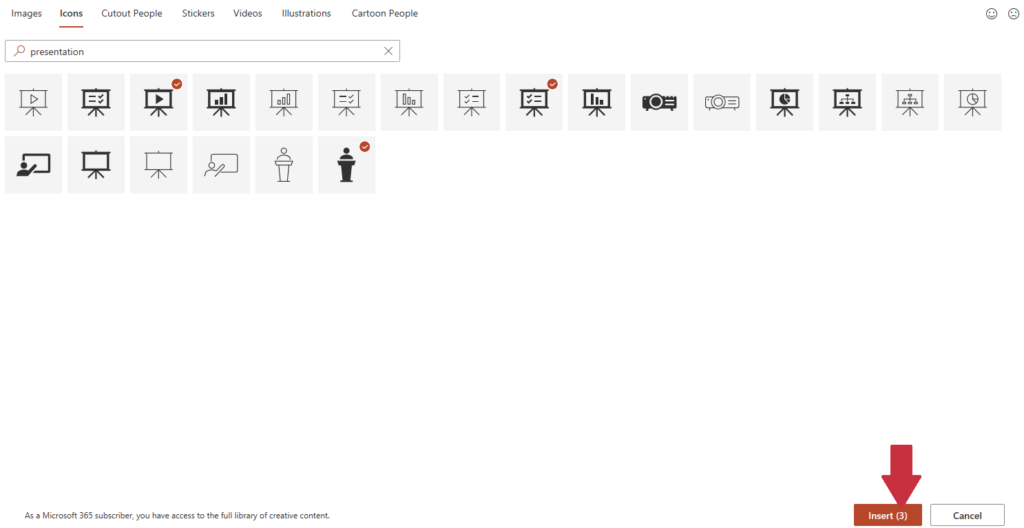
PowerPoint offers its users a great selection of free icons. Just go to the Insert tab and click on Icons. A pop-up window opens, with a selection of over 500 PowerPoint icons sorted into categories. Using the search field, you can find suitable icons with a keyword.
How to insert icons in PowerPoint
Once you’ve found the icon you want, just click on it. A check mark will appear beside your selection. To place the icon on your slide, just click Insert. Done!
Want to insert more than one PowerPoint icon on your slide? Then just select as many PowerPoint icons as you want before clicking Insert. (PowerPoint handily keeps count of how many icons you have selected.)

Customizing PowerPoint icons
Microsoft PowerPoint offers black icons by default, but you can easily change their color, resize them, and adjust individual elements of each icon.
To edit your PowerPoint icon, just click on it. The Graphics Format tab will open.
To change color In the Graphics Format tab, click on Graphics Fill. You can now select color you want from the pop-up window, or set a custom color under More Fill Colors.

Editing individual segments of icons
Microsoft PowerPoint allows you to customize individual components of icons. Here’s how:
- Go to the Graphics Format tab, and click on Convert to Shape.

- In some PowerPoint versions, a pop-up window will appear warning that the icon is being broken down into its individual parts and no longer represents a unit. Click on Yes to continue.
- You will now see the icon broken down into its individual parts on your slide. To edit individual elements, press the key combination Ctrl + Shift + H to ungroup them.
- You can now simply edit whichever elements you want, separately.
- When you’ve finished editing , you can save your customized icon as a vector graphic, so that you can include it on your slides in the future. Just right-click it, and in the context menu that opens, select Save as graphic. Tip: Save the vector graphic as an .emf or .wmf file. You can use these files in all PowerPoint versions without any problems.
These are the aspects to consider when using icons in your presentation
Choose icons that align with your target audience and the theme of the presentation. It’s important to select icons that resonate with your audience and are relevant to the content being presented. Use icons sparingly to avoid overwhelming the slides. Icons should enhance the message and not distract from it.
Ensure consistency in the use of PowerPoint icons. Harmonize their size and color to maintain a cohesive and professional appearance throughout the presentation. Consistency strengthens the visual identity of the presentation and contributes to a strong brand perception.
PowerPoint icons play a significant role in brand communication, so it’s crucial to use the same icons consistently to reflect your corporate design. This enhances brand recognition and memorability, as customers and partners associate the icons with your brand and develop a positive connection, ultimately fostering brand loyalty and improving the image of your company.
Icons from PresentationLoad: 4 great ways to use PowerPoint icons
PresentationLoad offers a wide range of professionally designed PowerPoint icons. These can be used across many subject areas, and are individually customizable. We have compiled four great ways of using them effectively:
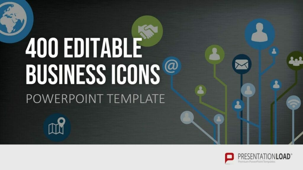
Business Icons
Using business icons means you can represent various products, operations or general aspects of the business world, saving space on your slides by doing so. Icons allow content to be communicated to your audience in a visual, immediate and memorable way. You can avoid long, tedious blocks of text by replacing some phrases with relevant icons.
Icons are also easy on the eye, loosen up your presentations and have a fresh, modern look.

Agenda Icons
Every presentation needs an agenda, to give your audience a short, structured overview of the contents of your presentation. We’ve covered how to put together an effective agenda in this article: Table of Contents.
Many people automatically use bullet points in agendas. These can look tired and unimaginative. Replacing them with our Agenda Icons adds pizzazz and visual interest to your presentations. Agenda icons allow you to put together your agenda more creatively and vividly. Your presentation will look altogether more modern and interesting.
Pictures have been proven to be more memorable than text. So using PowerPoint icons helps to make your presentation memorable to your audience.
Try Agenda Icons today and start your presentation with the right first impression!

Flat Design Icons
Flat Design is a sleek, graphically minimalist design style. It’s well suited to the simple visual nature of icons. With our Flat Design icon collection 2.0, we’ve added drop shadows and highlights in different color palettes to extend the style. This gives the icons depth, and makes them more impactful due to the color contrast.
Save space on your slides and convey content in a vivid and memorable way by using flat design icons.

Isometric Icons
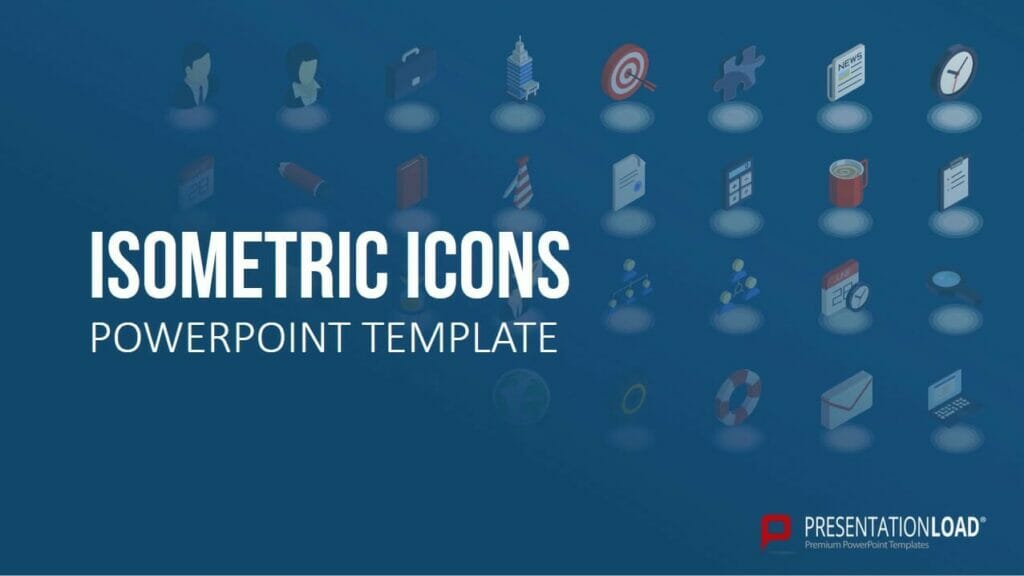
Isometrics is the design trend for modern presentations. Isometric design moves on from the previously dominant flat design. Isometric PowerPoint icons retain the simple, minimalistic visual impact of flat design, without special effects such as shading or gradients.
Where Isometrics differ from Flat Design is in three-dimensional representation, which gives the isometric designs a perceptible depth. The 3D design makes the PowerPoint icons look even more vivid and interesting. It also allows more detail in the icons, so you can customize them to fit your theme even better.
Isometric icons are also great for replacing bullet points. Try it out, and keep the thread of your points going with visual accents!

Further icon ideas
Have a browse around our store! We have a great range of professionally compiled collections of PowerPoint icons, with extensive coverage of different designs and themes useful for your business.
► Shop the store now!
To sum up: Using PowerPoint icons leads to more visually interesting presentations
Using PowerPoint icons sparingly and intelligently means you can present your content in a more vivid, memorable, and varied way. They allow you to simplify your slides and save space, making a good impression on your audience.
Still have questions about PowerPoint icons, or other PowerPoint related topics? Do feel free to contact us at [email protected]. We’re always glad to help!
Our store contains a great range of PowerPoint icon collections. All the icons are customizable. Have a look and try them out today! ► To the store
You might also be interested in the following articles:


