Isometric Design Is Trending: What Does It Mean for Your Presentations?
Isometric design is currently the hottest thing in the design world. This ultra-modern design can be seen on many websites and in PowerPoint presentations. Our world is three-dimensional, so it is not surprising that graphics that appear to have depth are better perceived by Internet users than flat objects.
Isometric graphics are simple but 3D. Based on the tried and trusted trend of minimalistic flat design, these graphics don’t need complicated effects, such as shading. Using isometrics, you can create professional, unique and realistic 3D graphics. This new design trend opens up an exciting world of display options, especially for product and company presentations.
Isometric graphics: 3D done differently
Isometric designs are a further development of flat design. Other 3D designs use the traditional view of perspective – vanishing lines and converging perspectives. In isometric design, all surfaces are either at right angles or 30 degrees. This is a bit technical, but means that it’s very easy to set up, and very clear for the viewer. It means that even complex 3D structures can be shown clearly but in detail. In addition, all isometric graphics and designs are compatible with each other and can be combined as desired.
Why are isometric designs so popular?
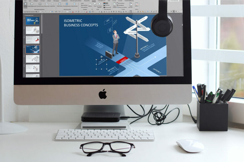
Isometric designs are a great way of creating customer-oriented graphics. They allow you to create clear, realistic and quickly understandable 3D structures, which are now more popular than the hyper realistic variants of skeuomorphic design (that is, design which purposefully sets up graphics of things like buttons to mimic their form and function in real life) . While 2D graphics used to be rather low-contrast and boring, isometric variants can be created with high contrast and detail. In the area of marketing, this design trend opens up new possibilities of adapting content flexibly to reflect customer needs and incorporate your own corporate design.
Changing perspectives with isometric graphics
Previous graphics, mainly produced in flat design, could not display, for example, a curved screen. With isometric illustrations, this is no longer a problem. What previously appeared flat can now be given impressive depth with isometrics. You can quite literally show things from a different perspective, with the ability to see the design from different sides. It’s a great way for companies to present a service or product in a graphic and easily understood form.
If your business is marketing and you want to offer your customers several design options, for example, isometric design can be used to create amazingly impactful offerings. In comparison to flat design and skeuomorphic design, isometric technology provides a 3D design that is actually easier for the brain to understand than the traditional use of perspective!
Flat design vs. skeuomorphic design
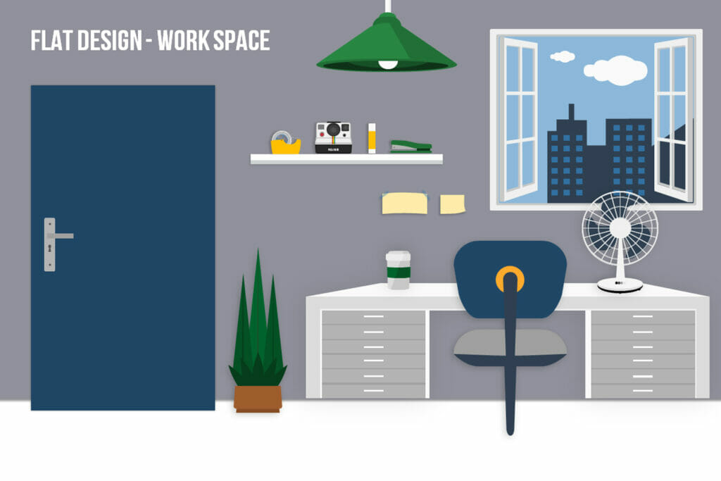
Flat designs don’t even try to imitate reality. They avoid shading and use even blocks of color. They don’t even use simulated light sources. They basically present a schematic representation rather than anything like a realistic view. This can have its uses, though, as it simplifies matters and allows you to get to the point without distractions.
Windows has often used flat design, while Apple has used skeuomorphic design. The elements in Apple’s iOS provide examples of the latter. This can be recognized in the tiny details, such as a calendar app with a quilted leather look. The address book is also skeuomorphically designed in various iOS versions: Apple makes it look like an actual open address book.
The simplicity of flat design but better!
As noted above, flat design’s simplicity is an advantage, but skeuomorphic graphics seem more “real” to people. Isometric design combines the simplicity of flat design with the feeling of depth and “reality” hinted at by skeuomorphic design. This is very exciting in terms of what it can offer. It allows you, for example, to create icons which appear raised or have an embossed effect.
The realistic-looking depth of such icons, along with their clarity and simplicity, make it easy for users to click on them. The 3D effect allows you much more scope than a simple flat design, giving the impression of depth. Instead of an object (say, a building) being represented on a map by a flat rectangle, with isometric design it can now be seen with a flat rectangle for the roof but it now has sides!
So how do isometric designs work?
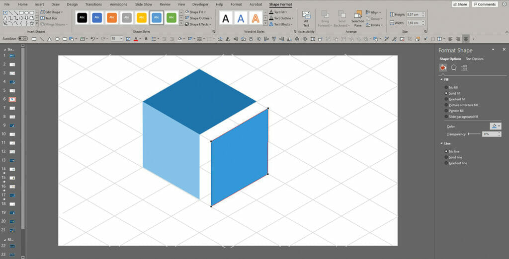
Isometric designs use simple techniques which are easy to implement for experienced designers. If you are a designer who wants to try them out, there are a few basic rules. Isometric design techniques have an isometric grid, which ensures that no lines converge.
A design is isometric only if it follows the isometric grid; vertical lines remain vertical as they progress, and all horizontal lines slope at 30 degrees. This is also called the 120-degree rule, which states that the angle between the X, Y and Z axes must total 120 degrees.
A quick overview of the rules for isometric design:
- It must follow an isometric grid
- It can’t include converging lines
- Vertical lines stay vertical, while horizontal lines are at 30 degrees
- The X, Y and Z axes together add up to 120 degrees
The confusion of conventional perspective
Traditional perspective techniques, with their converging axis lines, create a certain confusion in the human brain when used to create 3D objects. Weirdly enough, isometric design, with its simplicity and lack of traditional perspective, is actually easier for the brain to understand. If you look along a street running to the horizon, for example, it seems to become narrower the further away it goes. Isometric design shows it as the same width all the way along – which, when you think about it, it actually is!
So isometric designs can represent objects as they really are. They can provide a simplicity that our brains crave. However, the 3D element really needs to be used sparingly. Too much fussy detail and the clarity of the original design is lost.
Too much information at once puts people off. Isometric designs are great for anyone who wants a simple design with depth. As well as being on trend, they increase the recognizability of objects. Meaning that your brands and icons can be made to stand out without losing their uniqueness. A well-executed isometric design means that the customer will immediately recognize your brand.
When to use isometric design
Isometric design is perfect for logos and icons. It just knocks the spots off flat design, with its illusion of depth and fresh, modern look. That’s not the only use, though:
Bring your old 2D maps to life
Isometric designs can refresh your old maps, and allow many more details to be conveyed. It becomes easy to show, for example, where your customer parking is located. Isometric design is a great way to deliver such information clearly, making much more sense to your customers than a 2D map.
Infographics
Infographics adapt brilliantly to isometric techniques. The added depth and perception of 3D makes them so much more interesting to view, meaning that the viewer is tempted further, meaning (in internet terms), more clicks!
3D hero images
Hero images are large web banner images, often used front and center of a homepage, which have traditionally used flat design. Isometric techniques allow 3D hero images, which can be designed playfully and with simple colors. These invite the viewer to click on individual banner elements, meaning that they are drawn in to the story your website is telling.
Is the isometric trend right for you?
3D graphics designed using isometric techniques invite the user to click or take a closer look. Whilst they are clearly and precisely designed, they create the illusion of reality, offering creative minds a wide range of design possibilities.
Isometric techniques are great in marketing, but they are also immensely useful in medicine and many other fields. Isometric design is advantageous wherever clear information is needed. As with all trends, though, isometric design should not be overused.
Conclusion
Isometric design is a great technique for bringing 2D flat design to life. The innate advantage is that we perceive graphics using isometric drawings as being even clearer and more realistic than traditionally “realistic” 3D graphics, which make use of perspective.
Isometric designs create a reality in which we can perceive things as they are. Weird but true; and this makes them a great addition to the design alternatives already in your portfolio.


