Images in PowerPoint presentations: Here’s 2 ideas how to skillfully include them!
It’s commonly known that images in presentations get more attention than long texts. To use this effect for your presentation without missing out on important information, there are several options.
In this article we will introduce two options that allow lecturers to combine texts and images in a visually appealing way.
Option #1: Creating your slides in a grid look: tutorial
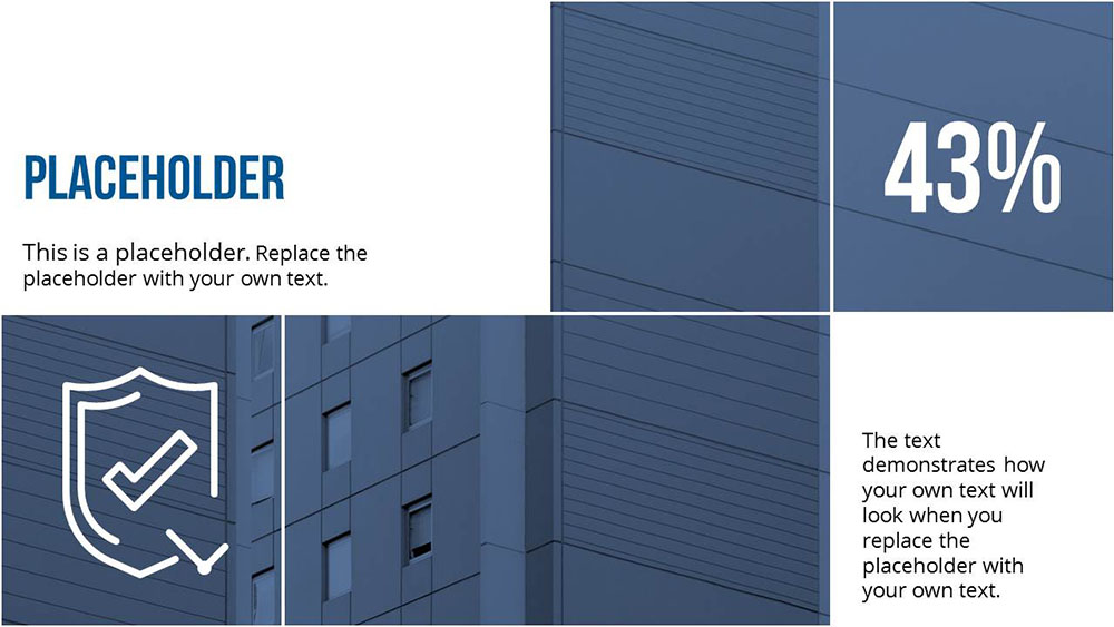
You might have heard of the grid look: thanks to the grid look you can unite image and text elements on your slides. For example, this could be the combination of product pictures and product information.
So that you can also make use of this technique, we have put together a guide for you in this paragraph.
1. Create raster
First, place the shape you want (for example, a rectangle) in different sizes on your transparency and add white outlines to the shapes.

2. Prepare image
Now, select all the shapes in the grid using the Shift key and then group them using Control + G or Command + Option + G for Mac. Now paste the image you selected on the slide and place it over the grid. Now adjust the pasted image to the size of the grid and cut it out afterwards using Control + X for Windows or Command + X for Mac.

For more tips on what shortcuts, you can use when working with PowerPoint, have a look at our “shortcuts for PowerPoint” article.
3. Insert image in grid
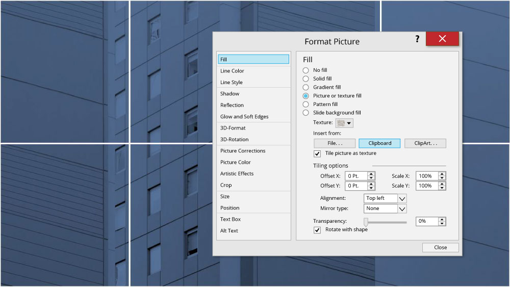
Next, select the grid with your right mouse-button and choose “format shape”. After that, select “image or text filling” and then choose “paste from clipboard”. Your previously selected image is now on the individual shapes of the grid.
4. Text and color
You can now fill the individual parts of the grid with appropriate colors and text. Since the image and text are part of the grid they act as a unit and can be absorbed by the audience easier. However, ensure that the font you use is easy to read and that the color contrast between text and background is appropriate.
Option #2: Text on images
As an alternative to the grid look, you can also visually enhance your presentation by adding text over your images. Here you have various design and application options which we will introduce in the following paragraph.
Possibility #1: As heading or chapter isolator
The first step here is to choose an image that you would like to have as the background on your slide. Next, place a shape (this could be a rectangle for example) on your slide and select it to edit the form’s filling and transparency. For a sophisticated design effect, we recommend setting the transparency low enough so that the background image shimmers through the shape.
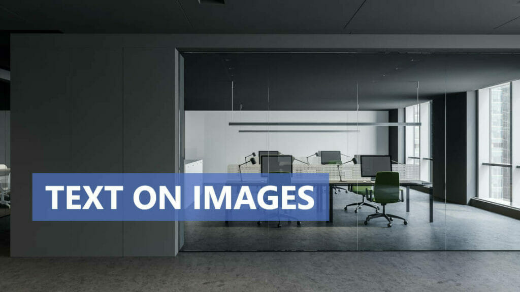
Once you have edited the shape, you can write your heading or other information on the shape as you wish.
Possibility #2: Placing a longer text on an image
If you decide to place a longer text in a shape on your image, you can start off by following the same steps as explained under option #1. We recommend filling the form you are placing the text on, with a 50% transparency. This way, you can ensure that your audience can read longer texts just as well as shorter ones.
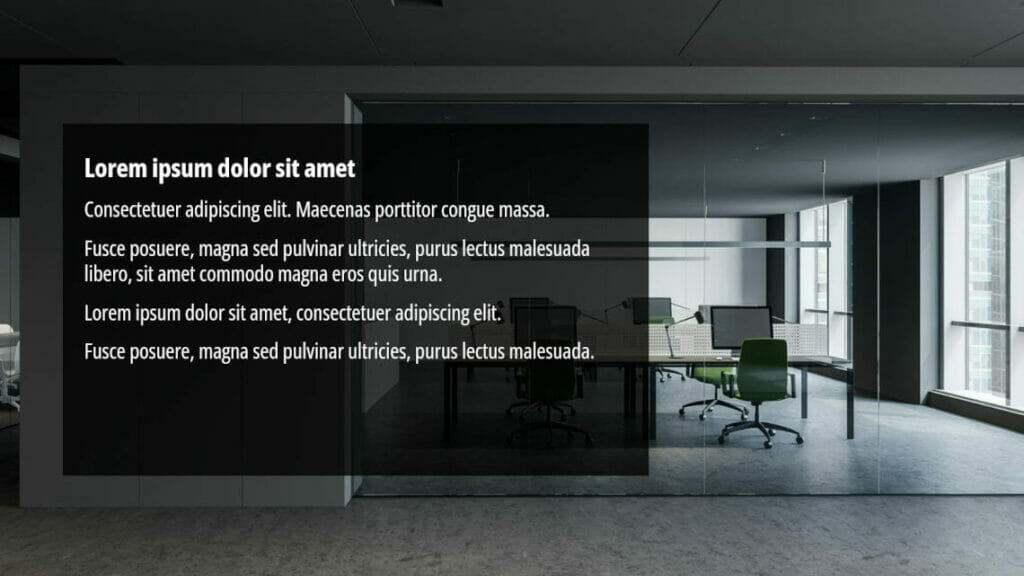
Option #3: Rectangle with transparent gradient
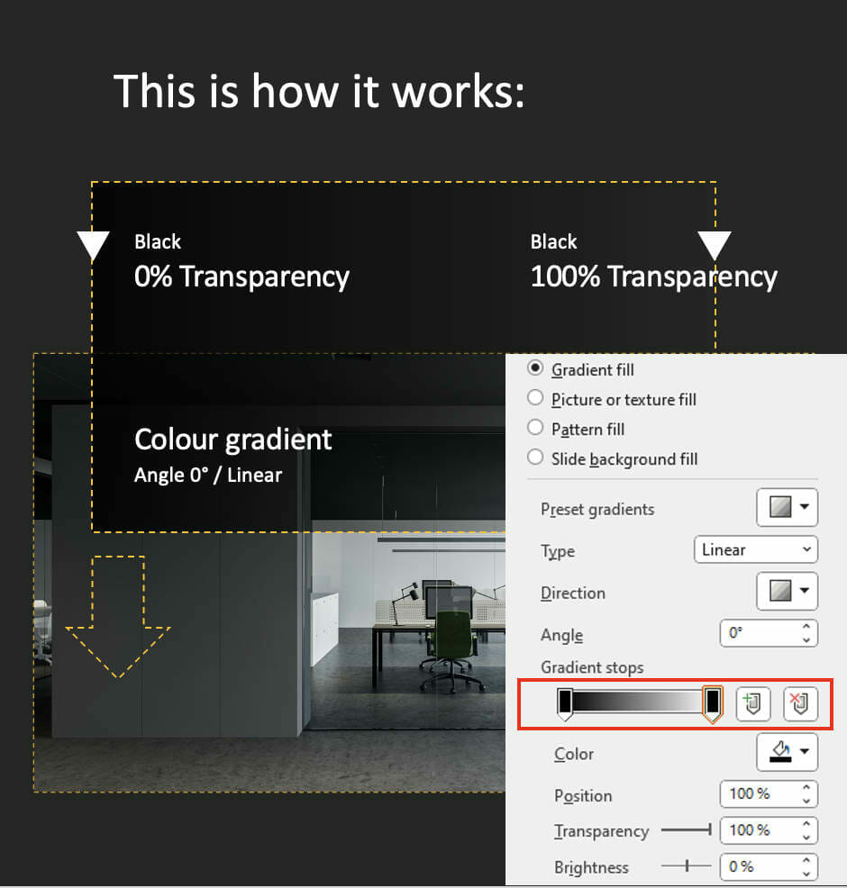
As an alternative to a shape with low transparency, you can also get creative with the gradient between the shape and the image. The most suitable shapes for this are rectangles or squares as these can easily be adapted to the shape of the slide. Drag your shape over one of the sides of your slide and then darken it with a transparent gradient.
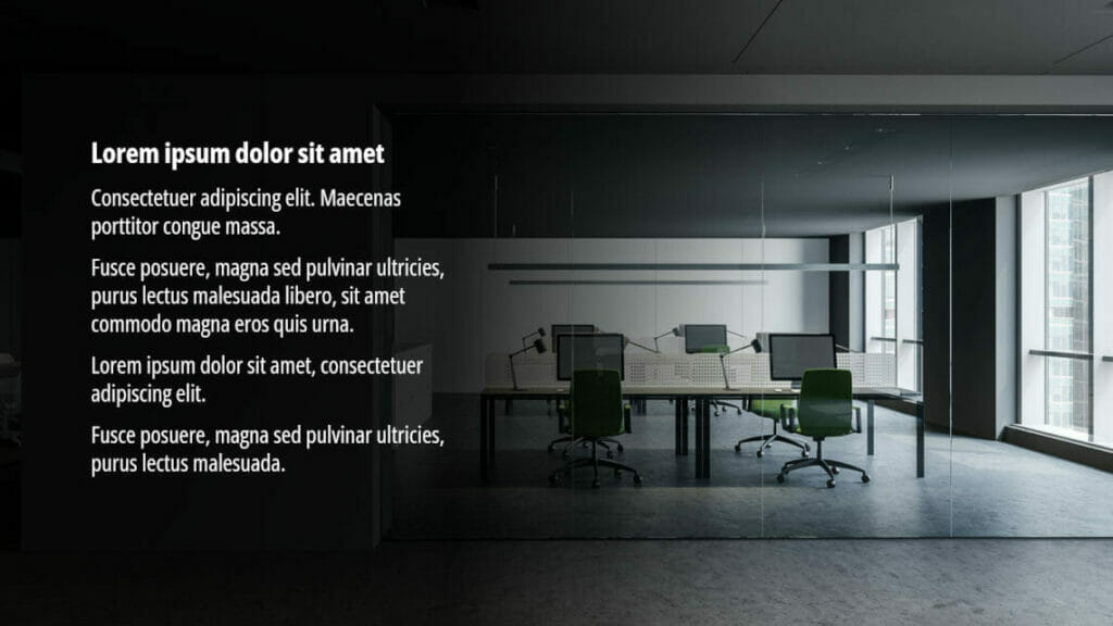
You can find out how this works here:
3 pros of image and text combinations
Even if these solutions seem more complex at first glance than just building image or text slides, they bring some advantages.
#1: Attention from your audience
Presentations that only consist of text slides and an image every now and then, seem boring quickly. Too much text can overwhelm your audience on one hand and on the other hand slides that are too monotonous make your audiences’ attention dwindle after a short space of time. However, combining images and texts on your slides means that there is more variety in your presentation which leads to your audience having a longer attention span.
To find out more about how to ensure that your audience attentively listens, have a look at our blog article about “audience attention”.
#2: Professional looking design
Even if you think you are an amateur when it comes to PowerPoint, you can convince your audience of your design skills with visually pleasing image and text combinations.
#3: Introducing products
Instead of simply introducing your products with images and texts, you can connect these elements with the grid look. This way you can convince your audience of your product by presenting product images and information on your slides in a visually appealing way.
Furthermore, you can use professionally designed slides by PresentationLoad to present your products.
More editing options for images
If you use pictures in presentations, you have probably realized that there are multiple options with their use, ranging from size to design. Make sure you always customize images to fit your needs. We have selected a number of other helpful blog articles for you, giving you more valuable tips on how to use images in presentations.
- Pecha Kucha Presentation: 20 images in 20 seconds
- Compress PowerPoint images
- Flip images in PowerPoint
- Make a PowerPoint Picture transparent
- Scan&Paste-App: Insert Images faster
- How to deal with images
Conclusion: Use text and image combinations for more attention
Try our design ideas for yourself and see how easy it is to convince your audience with sophisticated image and text slides!
Do you have any questions on the grid look, texts on images or regarding PowerPoint in general? Don’t hesitate and contact us at [email protected]. We are always happy to help.
Are you looking for visually supportive and professionally designed slide templates? Feel free to have a look around in our store. Here we have numerous slides prepared for you to download on a wide variety of (business) topics. Take a look today! ► To the shop
More articles, that you could be interested in:


