Creating a Handout to Support and Enhance Your Presentation!
Got a presentation coming up and need to create a useful handout to complement it? Great idea – but how do you go about it? Many people think handouts are just used in college, but in the business world they can be really useful to reinforce the content of your presentation.
Whether it’s a business meeting or a training course, a handout will underscore your points and support your presentation when done right. It can be tricky, though, to decide on what to include, the format, how to structure a handout and at what point of the presentation to distribute it.
Before starting to create your handout, you need to think about such things as structure, content and timing. This blog covers everything you need to know!
What is a Handout?
As the name suggests, a handout is any type of document that a speaker hands out to participants during a lecture, presentation, conference or meeting. It allows your audience to get a clear overview of the main points, or to sum up what they have heard afterwards.
A handout isn’t just a summary of slide titles; it can be much more detailed, summing up each individual topic and serving as a reference for core concepts and central insights.
What is a Handout actually for?
Your handout must provide added value. It contains information either covered or referred to in your presentation, allowing you to expand upon what might have only been touched on, and free your slides from clutter.
It can not only summarise your arguments, but can relieve pressure on your slides: dense facts and figures can be sidelined to the handout, allowing your PowerPoint presentation to be slick and professional.
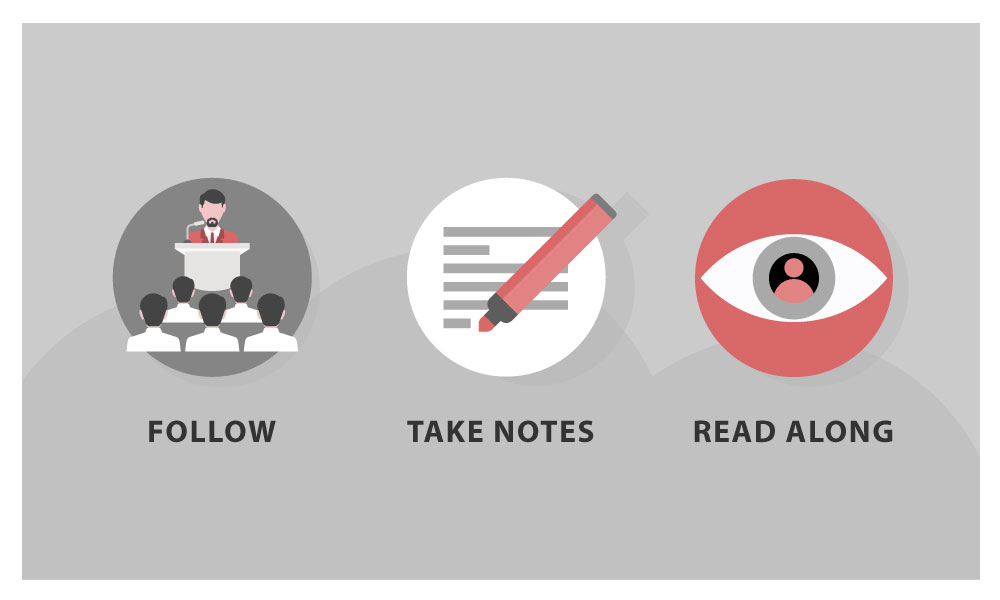
Handouts offer three main advantages to your audience, depending on when they’re given out:
- The audience can follow what is said during the presentation
- The audience can make their own notes to supplement or clarify for themselves what you have presented
- It consists of an overview of what you have presented, which can then be read by interested parties
A handout not only means that you can create a clean and uncluttered presentation, but allows your audience to understand your points better and remember them afterwards. It’s also very useful for conveying your arguments to anyone who may have missed the actual presentation.
Tip: So why not just Start with the Handout?
There are obvious advantages both to your audience and yourself to having of a clearly structured handout. Once you know what to do, they can be relatively straightforward to produce. Of course, this still takes time, and you need to allow for this.
Cobbling together a handout at the last moment is not only stressful, it can be counterproductive, as it undermines your professionalism and never goes unnoticed.
TIP: For a change, why not start your presentation with a handout? By getting the essentials out of the way first, you can then develop your presentation step by step using the handout as a basis.
The great advantage here is that you not only end up with a detailed handout, but you find a strong common thread, allowing you to create an equally “crisp” presentation and navigate your way through it.
Creating a Handout: How to Structure it
As with most things concerning design, the motto “less is more” applies very effectively to handouts. In concrete terms, this means: do without whole sentences and make use of key points, abbreviations, arrows and symbols. Ideally, your handout should not consist of more than two A4 pages.
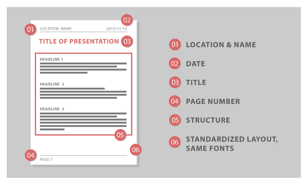
In addition to important information from your presentation, a handout needs to include the following:
- Basic information, probably in the upper left corner of the handout, such as the location of the presentation and the speaker’s name and title
- The date, probably in the upper right corner
- A concise heading – preferably the title of your presentation – centered
- Page numbers in the footer
- A clear structure, based on the individual headings of the presentation
- A consistent page layout using standard, unembellished fonts such as Arial or Times New Roman
The structure of your handout should follow the structure of your presentation, especially if you give out the handout during your presentation. It is best to limit your points to those which support your main argument. Keep the sub-items on the handout as simple as possible and don’t go into too much detail.
To make your handout visually appealing, it helps to think about the font. In addition to using clear, standard fonts, as mentioned above, try to keep the font size in the headers and footers uniform and smaller than in the main part.
TIP: Create an area for the audience to make their own notes on your handout. Either make the right margin wider or leave a few lines of space under your last point.
Handout Content – Short and to the Point
You’ve decided the layout of your handout, entered the key points and created a rough outline. Now it’s time to expand on individual points and create the main content of your handout.
Before doing so, focus on your target audience: how much background knowledge can you assume they have on the topic of your presentation? Keeping your audience in mind means you tailor the handout to their level, avoiding technical terms where they would distract from your point, including them when you are faced with an audience knowledgeable in a particular discipline.
It is very important to condense the core statements of your presentation into key points, rather than including a distracting stream of text. This way, you retain your audience’s full attention.
TIP: To arouse your audience’s curiosity right at the beginning of your presentation, you could include an upbeat quote, a proverb or a question. Choose a slightly provocative question to get your audience thinking from the start. You can repeat this verbatim on your presentation handout.
Although the main thing about handouts is that they should be short and concise, they should still be understandable when read outside the context of your presentation. If this is forgotten, they can’t act as an aid to your audience’s memory afterwards.
Nice-to-have: Additional Information on Your Handout
The main elements of a handout, as covered above, can be supplemented by additional information as you choose. This can even include pictures or graphics. Depending on the topic, a visual element can really clarify and supplement your main argument and tie things together.
As a rule, however, it pays to keep pictures and graphics on your presentation slides because they take up too much space on the handout. The costs and benefits need to be weighed up in each individual case.
It is also a good idea to include contact information on the handout; an e-mail address is the minimum. Depending on the type and purpose of the presentation, you can also provide your business address and telephone number.
If your handout consists of several pages, it helps to put your contact details in the header so that they appear on every page. It can be useful to include a short bibliography in your handout if you’re using quotes or information from other sources. This way you can also link to relevant websites or further reading on your topic that may be interesting for your audience.
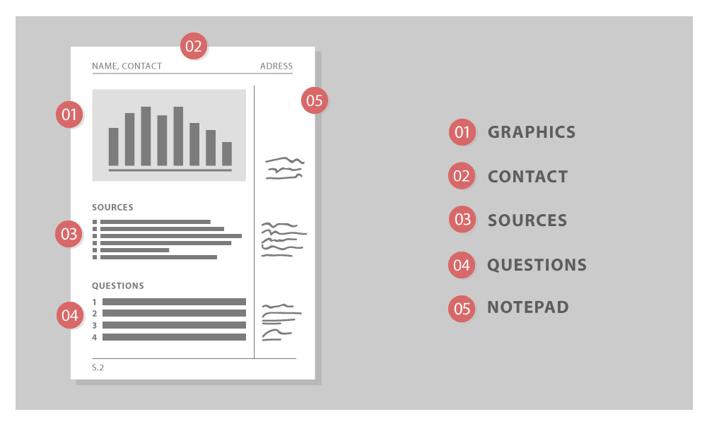
TIP: At the end of your handouts you can include questions or food for thought to stimulate discussion. This is particularly useful if you wish to conduct a question and answer session after your presentation.
Tutorial: Creating a Handout with PowerPoint
When time is of the essence, PowerPoint has a feature that allows you to create a handout in minutes. Using the “Create handout” function, you can transfer a PowerPoint presentation to Microsoft Word, adapt it there and optimize it for printing.
With just a few clicks you can choose which presentation slides should appear on the handout. The number of slides can also be easily adjusted and you can cut text or expand it as necessary. You can also decide whether the handout should include a note margin, a header and/or a footer.
Your PowerPoint presentation remains untouched during this whole process. In addition to the option of printing the handout, you can also save it directly in Word as a Word or PDF document – a simple way to make the handout digitally available to your audience.
- Open your presentation in PowerPoint.
- To find the handout master, open the View tab in the top taskbar.

3. In the Master Views submenu you will find, among other things, the Handout Master.
The practical thing about this is that with just a few clicks, you can choose slides from your presentation to form a basis for your handout. It’s also easy to customize headers and footers – to insert your contact details or page numbers, for example.
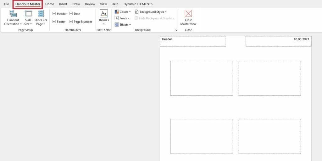
It’s really easy to choose the size, number and design of your pages here; and PowerPoint also offers the option of exporting the handout you have just created to Microsoft Word. This makes it simple to print out or offer to your audience as a file.
- To do this, click on “File” in the upper task bar and then on “Export”.
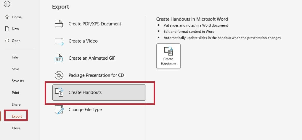
2. Select Create handout.
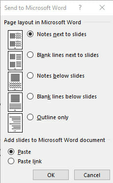
3. In the context menu that opens, you can decide whether your handout should have a margin for adding notes, for example, or other useful options.
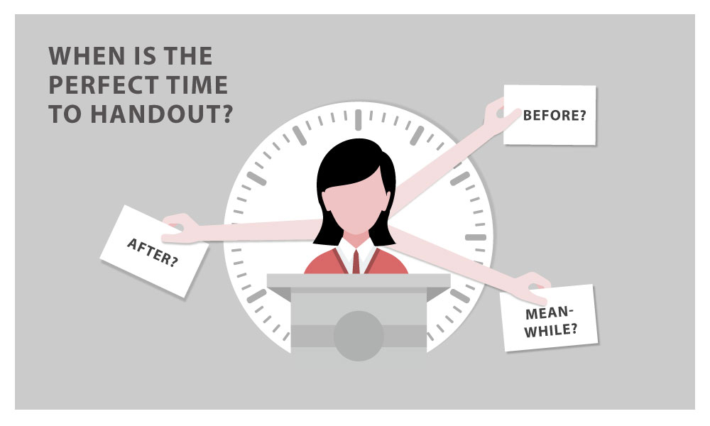
When is the Best Time to Distribute Your Handout?
There is no such thing as the perfect time. To help you decide the timing for your particular presentation, it helps to understand how timings influence your audience:
- Handout before presentation: In this case, you have to expect at least some of your audience to have leafed through the handout and read ahead, meaning that at any point they know what’s next. This can sometimes mean that your audience’s concentration is divided, so you need to consider carefully whether this option is appropriate.
- Handout during presentation: Distribute your handout at the point when it is useful as support, either in terms of visual illustration or as a means to emphasize your argument.
- Handout after presentation: If you choose this option, don’t forget to include your contact details. If you’re sending a handout electronically, PDF is a good choice. Depending on the situation and recipient, it might be advisable to add the copyright in the footer.
Our tip: Share your handout prior to the presentation. It is often the same arguments that are used when it comes to giving out the handout before the presentation: ‘Too restless, the audience rustles with the papers and does not concentrate on the lecture’ and many more. You probably know the arguments.
Nevertheless, our 25 years of experience with PowerPoint shows that these arguments should not be believed. Experience shows that it does not negatively affect the concentration of the audience, but even has positive effects for many to know that they do not have to take notes and that a protocol is available so that they can fully concentrate on the presentation.
In addition, listeners can add other relevant notes directly to the handout. If you withhold the handout until the end of the presentation, you also run the risk of having carried out a kind of unspoken “disciplinary action.”
Conclusion: Don’t go without a handout!
Whichever timing you decide upon, a well-prepared handout can be an effective tool to support your presentation, acting as a guide and memory aid for both you and your audience. Used properly, they can increase the interest and attention of your audience, and allow you to give a clear and professional presentation.
Need help with creating a presentation and a great handout to go with it? We have years of experience in the field of PowerPoint presentations. Just get in touch, and our team can help you create exactly what you need ► presentation agency
If you have any further questions about handouts, or anything to do with PowerPoint, feel free to get in touch at [email protected]. We’re always happy to help!
You might also be interested in the following articles:
