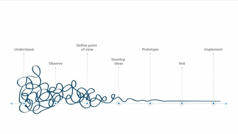
Flat Design: Eye-Catching for PowerPoint Presentations
Fresh, simple, elegant, crisp, and clean, the flat design look emerges and establishes itself more and more in recent years. With minimalist shapes and impactful colors, flat design offers appealing design options, especially for PowerPoint.
We not only want to provide insights into the use of this design trend but also give tips on how you can apply the design effectively for your purposes.
What is Flat Design?
Flat design is a minimalist design style characterized by clean, simple shapes, vibrant colors, and the absence of three-dimensional effects and shadows.
It originated in the digital design of user interfaces and web designs in the early 2010s when designers were seeking a simpler, more user-friendly alternative to skeuomorphic designs.
Skeuomorphism is a design approach where digital elements are designed to resemble their real-world counterparts, providing users with visual cues. In contrast, flat design focuses on simple, easily understandable elements, prioritizing user-friendliness and efficiency.
In 2012, Microsoft introduced flat design in the user interface of Windows 8, popularizing the minimalist design style. Since then, flat design has been used not only in software UI but also in print and online magazines for illustrating articles. It is also popular in infographics, web design, and advertising.
What are the advantages of using Flat Design?
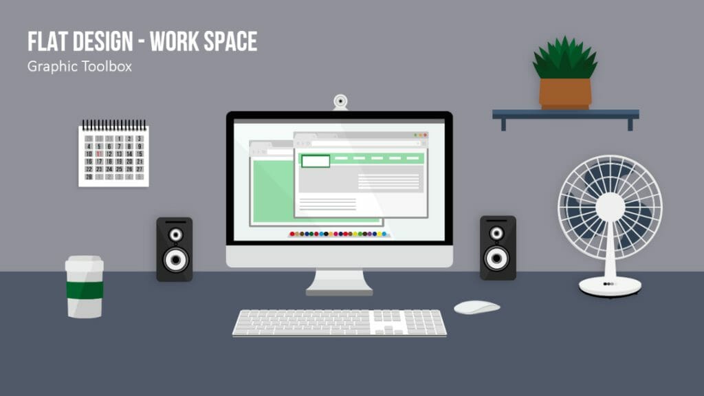
The use of flat design offers several significant advantages. Firstly, reducing design elements allows for better focus on the content and message of a presentation, directing the audience’s attention to what matters most.
Secondly, the use of vibrant colors and clear shapes ensures high readability and visual impact.
Flat design is easily scalable and adapts well to different screen sizes and resolutions, which is beneficial for presentations displayed on various devices. Furthermore, flat design promotes accessibility, as its clean design facilitates usability for individuals with visual impairments or cognitive limitations.
Did you know that the image size and color depth of your design can impact the loading speed of your presentation? Graphics representing the real world often include hundreds of millions of colors, which expands the image size and slows down loading time. On the other hand, graphics with three, four, or even eight colors have much smaller file sizes and load comparably faster. Additionally, flat design looks good on screens with both low and high resolutions, ensuring a consistent user experience.
PowerPoint presentations can be designed in a modern and stylish manner with flat design graphics. Utilize these minimalist graphic elements for your next presentation, opening up new possibilities for illustrating numbers, data, and facts.
Foundations for your Flat Design in PowerPoint
To effectively incorporate flat design as a design element in your presentation, it’s important to have a basic understanding of its key aspects. Here are the essential elements of flat design and how to implement them in PowerPoint:
- Color Scheme:
Expand your color palette! In flat design, color choice becomes crucial as it aims to simplify and focus on the essentials. This provides an excellent opportunity to experiment with color and tone, exploring how different shades work together in lighter and darker variations.
The color palette in flat design typically consists of bold, vibrant colors that create a clear visual hierarchy and draw attention to important content.
To achieve a harmonious color scheme, choose color palettes based on complementary or analogous color relationships. In PowerPoint, you can create custom color schemes or use pre-designed schemes to ensure a consistent and thoughtful appearance throughout your presentation.
2. Typography and Fonts
In flat design, typography plays a crucial role in presenting information clearly and legibly. The minimalist style emphasizes fonts, providing a defined finishing touch.
Choose simple, easily readable fonts without embellishments, such as sans-serif fonts. Make sure to use a limited number of fonts and employ different font sizes and styles, such as bold or italic, to structure, establish hierarchy, and highlight information.
3. Use of Icons and Symbols
Icons and symbols are characteristic of flat design and serve to convey complex information quickly and easily. In PowerPoint presentations, icons should be simple, monochrome, and devoid of shadows. Ensure that the icons in your presentation maintain consistency in style and size, using them to visualize concepts and support your content.
For more information and tips on using icons, refer to the “PowerPoint Icons” article.
Looking for icons for your flat design presentation? Feel free to browse our shop, where we offer professionally designed icons for download:
4. Use of Simple Shapes and Lines
To achieve the structure and clarity of flat design, utilize clear and simple shapes and lines in PowerPoint. Use geometric shapes like circles, rectangles, and triangles to create backgrounds, dividers, or other design elements. Ensure that the shapes and lines in your presentation are flat and devoid of shadows or 3D effects to adhere to the principles of flat design.
5. Think Structured
Good structuring can aid in arranging elements and creating a layout. Keep your arrangements and spacing simple and experiment with them. For example, let particularly important elements break out of the grid to highlight them. Scaling can establish a hierarchy, and precise placement can emphasize importance.
Additionally, consider viewing your layout from a complete page perspective (zooming out). This will help you better place individual components and achieve a clearer overview.
How to create a Flat Design presentation in PowerPoint
Creating a Flat Design presentation in PowerPoint is a simple process that consists of several steps. Here is a step-by-step guide to creating an appealing and effective Flat Design presentation:
1. Choose the appropriate template
Start your presentation by selecting a Flat Design template that aligns with your requirements and establishes a consistent design foundation. Choose templates that effectively support your statements and presentation theme. You can use Flat Design slides from PresentationLoad (see next chapter).
2. Customize color schemes and fonts
Adjust the chosen template to suit your specific needs and your company or project identity by modifying color schemes and fonts. Use vibrant colors that complement each other well and select simple, readable fonts that adhere to Flat Design principles.
3. Develop your slides
Create your presentation slides while adhering to Flat Design principles: Use simple shapes and lines to create structure and clarity, and incorporate icons and symbols to convey complex information quickly and easily. Make sure your slides are clear and concise and focus on the essentials.
4. Integrate Flat Design infographics and charts
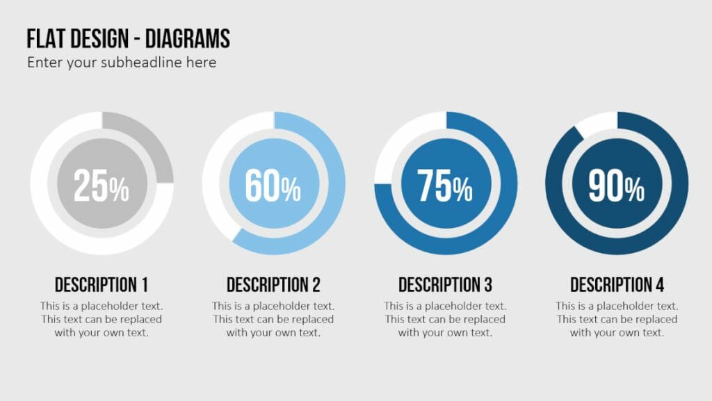
Infographics and charts are crucial elements for visually presenting data and information in a compelling manner. Customize your infographics and charts to align with the Flat Design style by using simple shapes, vibrant colors, and clear lines.
Tip: It is important to maintain consistency throughout your Flat Design presentation. Make use of various techniques and possibilities while ensuring a consistent design approach, resulting in engaging, effective, and user-friendly slides.
Tip #2: Whitespace plays a significant role in Flat Design. It helps structure information, enhances readability, and creates a balanced layout. Avoid cluttered slides and give elements sufficient space to “breathe.” This improves visual perception and enables the audience to focus better on the content. For more tips on this, you can refer to our article on “PowerPoint Whitespace.”
Flat Design PowerPoint Templates by PresentationLoad
Are you looking for suitable Flat Design templates for your PowerPoint presentation? In our online shop, we offer various sets covering a wide range of (business) topics. These templates are perfect for use in business presentations but are also suitable for academic presentations.
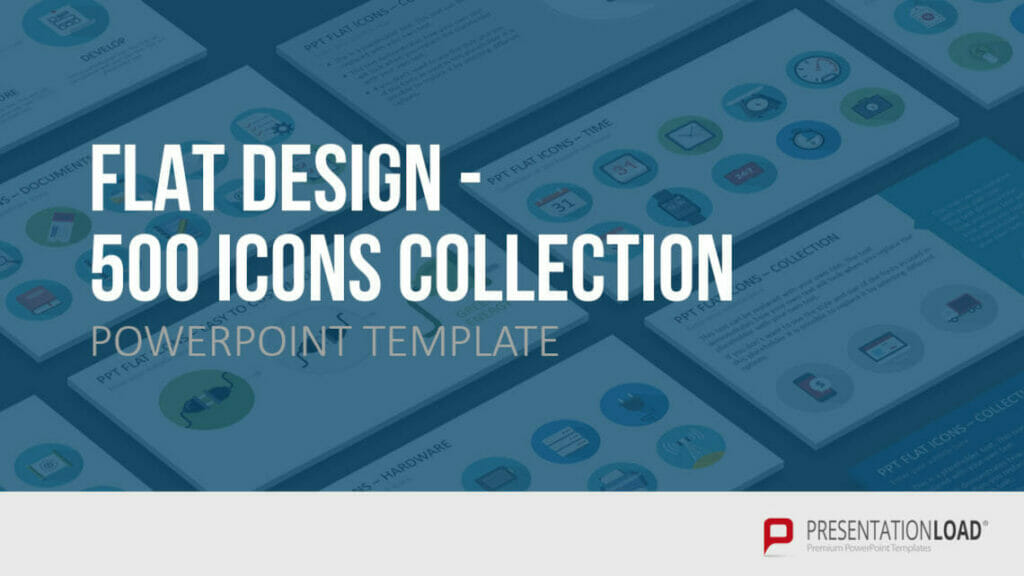
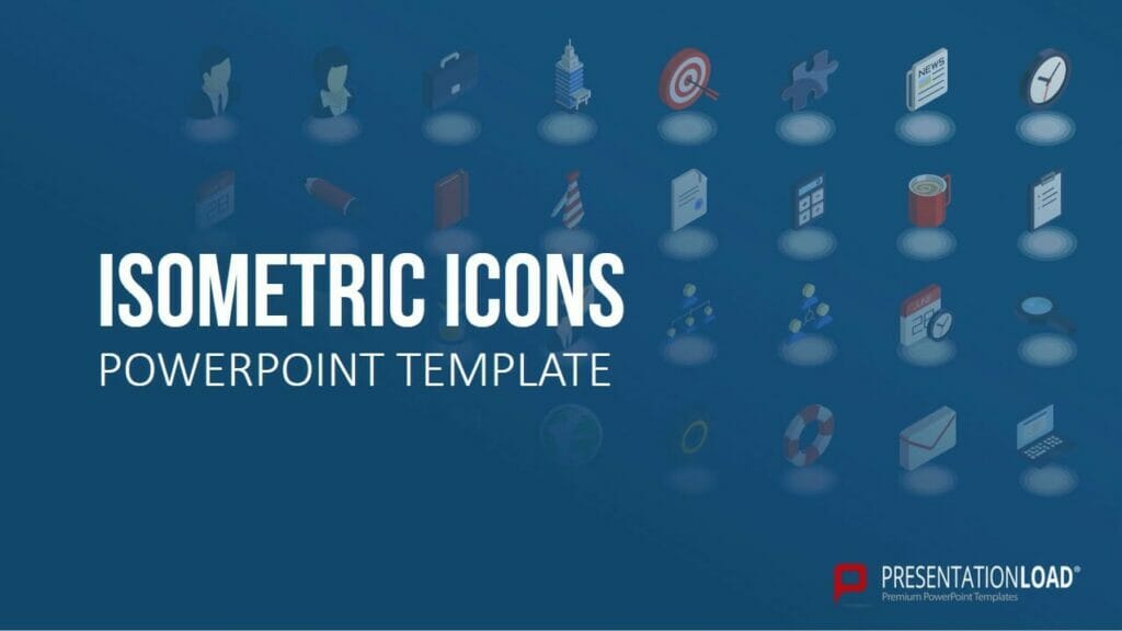
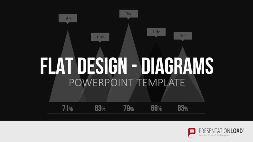
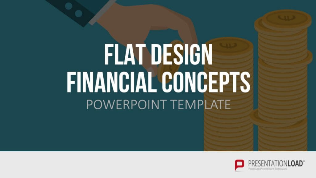
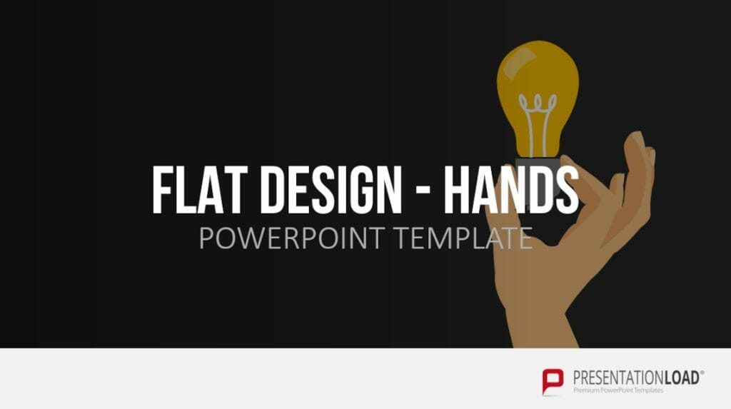
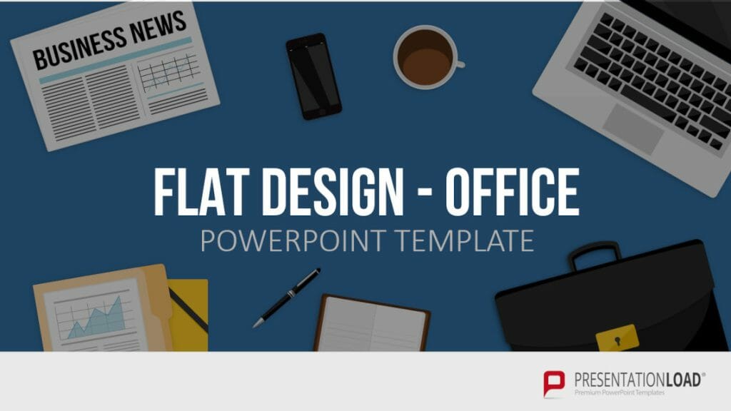
The motifs we use include diagrams, tile-shaped graphics, icons, texts with a long shadow effect, office motifs, mobile devices and computers, silhouettes, business templates, and much more. Here is a small overview for you:
All templates are 100% editable, allowing you to customize the Flat Design to your preferences. You can easily edit the templates without much effort: the individual elements on a slide are grouped, allowing you to move, resize, or recolor them easily.
Feel free to explore our Flat Design category for more options.
Conclusion: Make a statement with Flat Design!
In your next presentation, embrace the design trend of Flat Design. It brings a fresh and modern look, setting a different emphasis compared to traditional presentations. Utilize Flat Design techniques as explained in our tips to enhance and persuade your content effectively.
If you have any questions about Flat Design or PowerPoint in general, don’t hesitate to contact us at [email protected]. We are here to assist you!
Are you in need of visually appealing and professionally designed slide templates? Take a look at our shop. We offer a wide range of pre-designed slides for various (business) topics available for download. Visit our shop today! ►Go to Shop
You may also be interested in other related articles:
