Everything with Pictures in PowerPoint – Part 3
How to Ensure Quality Images in PowerPoint
Apply Animations the Smart Way.
Image quality, animations and layouts are the subject of our third blog post in the series of everything about pictures. You will certainly have encountered the problems described here as image quality and image layouts are matters you can’t get around and are among the most popular issues when it comes to image processing. The secret here lies not in understanding the fundamentals, but rather in helping yourself to useful tricks that can help solve arising problems.
Bigger Photos Without Quality Loss
A Description of the Technique
Since the progress of digital photography, presentations have an increasing amount of pictures. Most of the time, these pictures or graphics have a high pixel size that can be manually adjusted on the template by zooming in and out or altering the size. However, even with a high megapixel, the picture may be blurry. You may easily change this to achieve the optimal quality with a simple trick.
Basic Concept: Don’t reduce the size of your picture, but rather let PowerPoint do the resizing for you by calculating the megapixels internally.
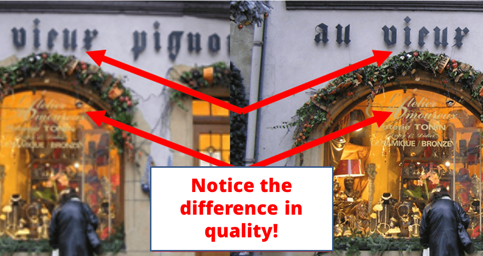
Observe the difference of this technique in an example of a zoomed-in figure of a saint. The head figure here is cut-out from a large original photograph and then duplicated.
The left image was reduced with the mouse, while the right image was also changed with the mouse, but to the final desired size.
Now, the right image is changed with the effect >Grow/ Shrink, >25%.
This step is repeated again to the right image, with the effect >Grow/ Shrink, >25%. After this, both images are the same size.
Finally, BOTH images are selected and the option >Grow/ Shrink, >1500% is applied.
The difference in quality is astounding.
At the beginning, this method may seem a bit out of your way, however, the process gets much faster after a few rounds and the result is worth the few extra clicks! After all, no one wants bad quality.
The example shows two identical photos, but edited differently. Both are first made smaller; one manually with the mouse and the other with the help of the animation options. They are then both zoomed-in by 250%. Although these pictures are identical, the quality of the details is clearly very different.
Experiment with your own pictures and see the difference yourself. Here is a step by step process how these pictures were edited:
Left picture:
- Insert from the desktop to the template with >Insert, > Picture.
- Reduce the size of the image with the use of your mouse.
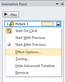
- Resize the image by going to >Animations and >Grow/ Shrink. Enlarge the image by clicking on Animation Pane, >Picture 1, then choose >Effect Options and increase the image to your desired size.
Right picture:
- Insert from the desktop to the template with >Insert, > Picture.
- Resize the image by going to >Animations and >Grow/ Shrink.
- Click on Animation Pane and a box should appear on the right side of your screen. Find the drop down arrow of >Picture 1, then choose >Effect Options and reduce the image size (try 40% or something comparable). You can enter a custom size, but make sure you hit the >enter key (not OK) after typing your percentage, or the size will not be registered.
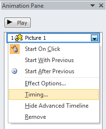
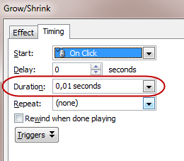
- Adjust the time lapse to 0.01 seconds by going to >Animation Pane, >Timing and >Duration.
- Now, make a second animation by going to >Add Animation, >Grow/ Shrink and enter the final enlarged size that you’d like your image to be. Also adjust the time lapse of this second animation to 0.01 seconds by going to >Animation Pane, >Timing and >Duration.
- So that your animations run smoothly without having to click for the next effect, go to >Animation Pane, >Picture 1, >Drop down arrow and >Start After Previous.
- Finally, so that you only see the large image and not the initial size reduction, add a white box over the image. >Insert a rectangle, change the shape fill and shape outline to white. Now click on >Add animation, >Disappear, and then on the animation pane, click on the arrow and select >Start After Previous.
You will surely immediately see the difference in quality between the two pictures.
This animation technique is especially great to use when enlarging maps. The clarity of geographical details is crucial to be able to recognize specific areas.
The more you zoom-in on a photo, the more blurred the content. If you want to enlarge your graphic by a lot and still have a good quality, always let PowerPoint do the work for you. If it is not enough with a sole reduction passage, simply repeat several steps in a row.
How to Effectively use Layouts and Panoramas in PowerPoint
Get rid of the fore and background problem and master layout animations.
Object Planes
Have you had few objects and images on your templates in the past? Then you probably didn’t have a problem with different planes levels and organizing your template. However, you can easily increase your capacity of layouts by using more of objects and images, but only advisable if you know how to effectively manage your objects. Let’s observe a problem you might run into when trying to have several different objects on the same slide.
The rectangular objects below (great for listings, inserting pictures and more) seem to lie next to each other on the same plane. However, if moved, you will recognize that these rectangles actually lie on various levels.
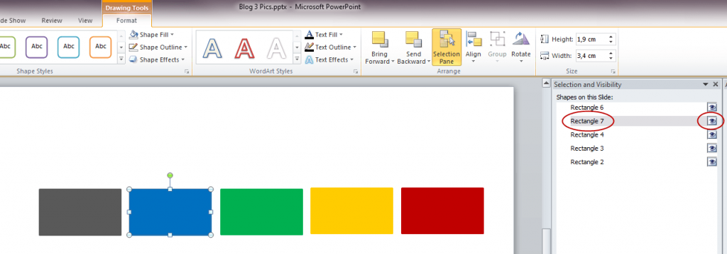
First, how to edit an object that is covered by others: many users don’t know the work tools selection >Format/ Drawing Tools, >Selection Pane. This selection pane shows you all the objects on the template and allows you to select them individually.
For example, the picture below shows the blue rectangle 7 selected. If you click on the eye icon next to “Rectangle 7,” you can make the object invisible. This option can be especially helpful if you have many objects on a template and you need to edit only one. Simply make the other objects invisible and enjoy easy editing access without having the concern of moving the others around. By the way, double clicking on the object in this menu gives you the option of changing its name.
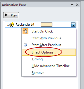
To expand the objects go to >Animations, >Grow/Shrink, and >Animation Pane. Then click on the animation arrow down, select >Effect Options and set your >Size.
This works nicely to expand your objects, but can also result in covering other objects and/ or be covered itself. See the image below:
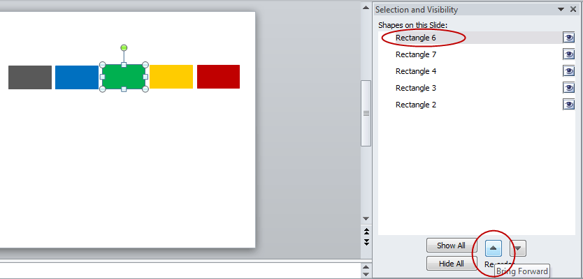
To avoid this representation, select the rectangle (with the animation), and click on the >Reorder arrow. Move the object to the very top. Alternatively, select the object by >right clicking and >Bring to Front. Now the rectangle should expand on top of the others.
This works well if you want to expand one object, but if you wish to make this expansion to several objects or in this case rectangles you will quickly run into a problem as the top object in the selection pane will always be on top of the others (and only one object can be first in the selection). Thus, you will need to slightly alter the trick.
Since this set has five rectangles, copy the slide five times (>strg + >D). Go through each slide and bring the desired rectangle to the top of the selection pane with the applied feature (>Animations, >Grow/ Shrink, >Animation Pane, >Effect Options and your desired >Size).
The object should now be visibly in the foreground, as wished and when played, it should look as though you have one slide and not five.
To make an even smoother transition, try applying the following:
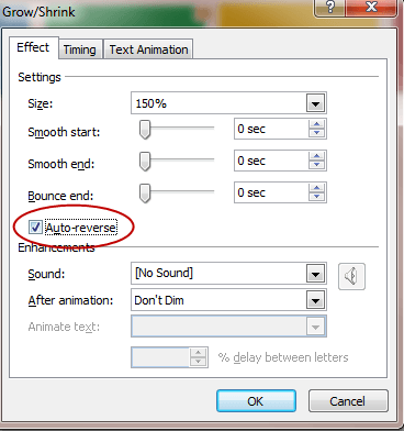
In the >Animation Pane, click on the >object, go to >Effect Options and select >Auto-reverse. This will make the object grow and shrink to the original size. When clicking on the object in the animation pane, you may also select >Start After Previous. This will have the effect that the transitions run on their own (without you having to click on them).
Apply this method to pictures or images relevant to your subject. Be creative when it comes to making your templates.
Animation with Photos
Some Tips for the Animation of Photos and Graphics
Since the 2010 version of PowerPoint, you may have noticed that animated graphics or photos move when in motion. This was not so in the 2007 version and unfortunately not much can be done to improve this. However, the slower the animation, the less it moves.
The following may also help:
- Compress graphics
- Try other graphic formats
- Make the graphic width no wider than the template
- Loosen with other animations
- Sometimes the location of the graphics plays a role
- Turn the hardware accelerator on or off
Panoramic Images
Extra wide panoramic photos may be complicated to fit into the template. Instead, a popular way to incorporate a panorama picture is to let it drift over the template. To do this, insert a picture, go to >Animations, >Lines and pull the red and green arrow horizontally to how you would like the image to pass.
Save Your Printing Costs
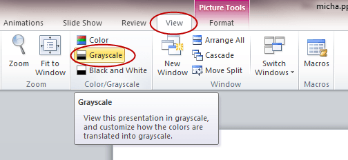
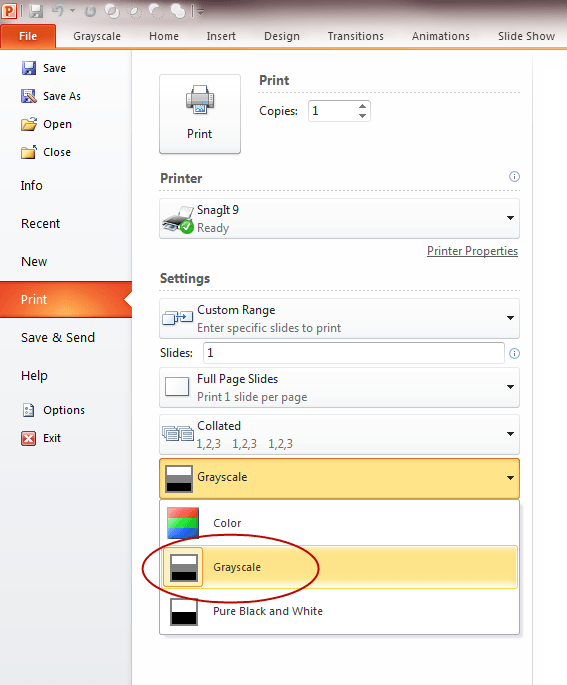
If you want to print your presentation and don’t necessarily need the photos, graphics or animations, then make sure not to print them! Simply go to >View, >Grayscale, and then select your images and click >Don’t Show. When you are done, go back to your slides by selecting >Back to Color View.
This operation does not affect your slide show, but rather gives you an option of printing without your images. Before you print, make sure to click on >Grayscale. This will blend out your pictures.


