Designing Effective PowerPoint Presentations – Structure and Text Layout
Content is not the only important component of a presentation. An effective layout provides the backbone of a presentation and helps communicate your message. Read on to find out how to effectively organize your presentation’s structure and text.
A presentation’s content and appearance go hand in hand, one is no more important than the other. Ideally, your presentation should be a seamless blend of concise content, a clear and coherent design, and a well-organized layout. To help you with this, we are going to focus on three important design aspects: structure, text layout and in our next article, color schemes.
Structure

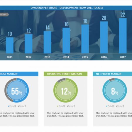
Structuring your presentation starts with deciding what information should go on each slide and what images and infographics will best communicate this content. For example, if you want to present your company’s continued growth over a specific period, an upward trend graph would be a good choice. Or if you want to illustrate related business concepts that contrast each other, you could use the same graphic to display both and highlight their correlations. Topics of varying degrees of importance can be visualized with different shapes.
Text Layout
When it comes to the amount of text on a slide, less is more. To keep text to a minimum, try using select keywords to summarize and explain your content. Keep headers short or better yet, replace them with symbols or infographics. Make sure to use a large and easy-to-read font so even those in the back row can follow along. Using a safe font is the best choice. These are pre-installed PowerPoint fonts that are easily recognizable and help to avoid compatibility issues. Some popular choices are Helvetica, Futura, Rockwell, and Gill Sans.
In part 1 of this blog series, we discuss how to choose the right color scheme for your PowerPoint presentations.


