Create a PowerPoint Presentation: Helpful Tips & Tricks!
Looking to create a PowerPoint presentation? Do you want to do it as quickly as possible, but still come out with a professional, effective and successful presentation? No problem. Keep reading to learn a ton of helpful tips and tricks.
Why create a PowerPoint presentation?

PowerPoint is the most popular software for creating presentations. PowerPoint visually supports your statements and enhances your speech. For more information about why PowerPoint is so popular, click here.
Thanks to its simple and straightforward interface, even beginners can create a PowerPoint presentation in a few quick and easy steps.
Every PowerPoint user starts with a blank slide. That means many crucial decisions have to be made regarding layout, design, content and much more.
This step can be really challenging for Microsoft PowerPoint beginners. As easy as it is to use PowerPoint, you as creator will have to make these decisions yourself. And sometimes that’s not so easy – after all, you want your presentation to be persuasive and reflect well on you.
This is where PowerPoint steps in. Using its numerous helpful and time-saving features, you can easily create your presentation. Keep reading to learn how to bypass time-consuming formatting or other complex settings today. Simply use PowerPoint templates.
Create a PowerPoint presentation: Your quick and easy guide
1. Preparation
Before creating a presentation, you need to prepare it. Your presentation needs a topic, an underlining message and a goal. What should your slides communicate to your audience? Take the time to think about this in advance.
It is essential to know who your presentation is aimed at. Every presentation you create should be tailored to your target audience. Therefore, take ample time before starting your presentation to conduct a target audience analysis. In our blog post “Target Group Analysis,” we explain step by step how to define your target audience and effectively align your presentation with them.
The right structure for your presentation also needs to be thought about in advance. A presentation without a central theme will not only throw you off your game but will also come off as unprofessional to your audience. You can find tips for the right presentation structure here.
2. Save time with professional templates
Looking to create a presentation quickly and easily without the need for time-consuming formatting? Then count on PowerPoint templates from PresentationLoad.
With our professionally designed templates, you’ll always create a PowerPoint presentation that stands out from the crowd. Our preset formatting, such as placeholders for text and images, will ensure your content is presented exactly the way you want.
Our designers create premium-quality, contemporary templates. We offer numerous templates on a wide variety of (business) topics. Here are just a few examples:
Our ready-made slides offer you the opportunity to use your own creativity. Consider our templates as a starting point which can be customized and refined further. There’s no need to spend time on tedious formatting – you can focus the finer details.
Take a look at our shop!
3. Start off strong
You’ve heard it before: First impressions matter. This counts for presentations, too. Having a strategy for grabbing your audience’s attention right from the start guarantees you’ll keep it for the entire presentation. After all, you want to sell your idea. And a rough start can make this really difficult.
For instance, start with an anecdote or captivate your audience by applying the technique of storytelling. Transform your presentation into a captivating story that evokes more emotions from your listeners. Tips can be found in the article “Storytelling.”
Find more helpful tips for the perfect presentation opening in the article “16 Ideas for Presentation Openings.”
4. Use less text. Focus on visual elements

Simplicity is often the key to success. This is why it’s important to avoid using a ton of slides in your presentation. In a nutshell: Less is more. The point of a presentation is to convince your audience with clear statements. Visual elements are the perfect medium for this. Take advantage of PowerPoint’s diverse range of visuals, such as pictures, videos and animations. Here’s an overview of the most important visual elements:
- Pictures
Pictures say a thousand words. Who wants to read tedious blocks of text on slides? Keep it short and use the 5 x 5 rule as a guideline (you can read more about this here). Pictures often communicate your statements better than words. Take the time to find the right images to support your statements.
Every image needs to serve a purpose and shouldn’t be used just for aesthetics or to fill an empty space. Go for real images that reflect your company as well.
Placing images correctly also requires skill. Avoid large images and instead, use a combination of images and text. They can be arranged next to each other or stacked above each other — whichever makes more sense. Which images should you use? Ideally, photos from a professional photographer. Stock images are an O.K. option but not very unique or special.
You can find more information on images in the following articles:
- Colors and Fonts
Do not underestimate the power of fonts and colors as visual elements. Even if you are using minimal text, you can still make it visually appealing.
For headlines, consider using a bold, sans-serif font, while for body text, opt for a readable, serif font. Ensure that the text is easily legible.
The choice of color palette can influence the mood of your presentation and positively engage your audience. It’s essential to use colors strategically, considering contrasts and harmony. A well-chosen color combination can improve readability, highlight important information, and create a consistent visual appearance.
For tips on fonts, refer to the article “PowerPoint Fonts.”
- Icons
Icons are small graphic elements that add a visual punch and structure to your presentations. They are simple but effective design elements that can be used to replace outdated bullet points. You can find a large selection of icons here. Here are some examples:
- Infographics
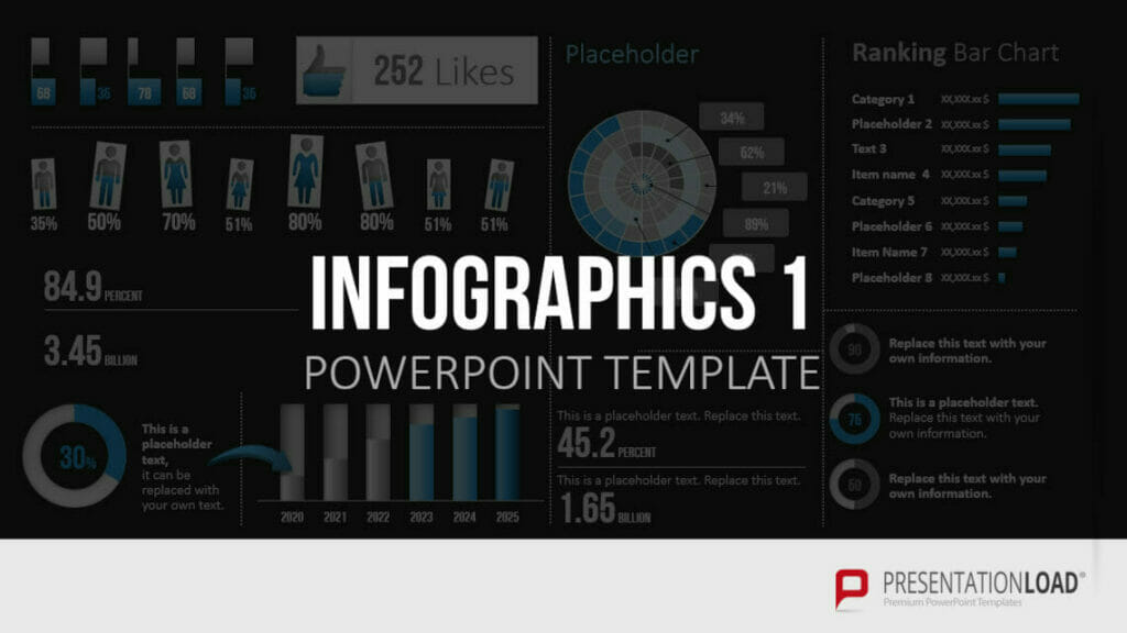
When you create a PowerPoint presentation, you need to communicate your message in a way that is visually appealing and easy to understand. Infographics can help you to do this. They clearly illustrate complicated issues and corporate data and add visual value to your presentation.
PresentationLoad templates are the perfect tool for this. With our professionally designed templates, you can easily create effective and impactful infographics to highlight your concepts and data. Feel free to take a look around:
- Animations
It’s hard to imagine modern presentations without animations. They’re masters at steering an audience’s attention and helping them stay focused on the topic.
Animations can be used to fade text in, step by step. This prevents the audience from strictly reading your slides rather than listening to you.
Here’s a detailed article all about animations.
- Interactive Elements
In addition to animations, you have many other options for incorporating interactive elements into your presentation. These support the attention of your audience and bring your presentation to life. Try integrating a quiz or use the morph effect.
Many more helpful tips can be found in the article “Interactive Presentations.”
3. Give an unforgettable conclusion
It’s not only the first impression that counts, the last one is just as important. Don’t spoil a successful presentation with a clumsy, poor ending.
Both your last slide and how you deliver it must be consistent with the rest of the presentation and create a cohesive conclusion that will resonate with your audience long after your presentation is over.
You can count on final slides from PresentationLoad. These professionally designed templates will help you create powerful conclusions. Take a look at these slides:
Check out this article for 20 helpful tips on how to close your presentation the right way.
After your presentation, remember to plan time for possible questions or new customers. Read here on how you can build your network and win new customers with your presentation.
Another way to stay in the memory of your audience even after your presentation is by creating a handout. In this handout, you summarize all the key points of your presentation in a concise form and include your contact information. Tips for creating an appealing handout can be found in the article “Creating a Handout.”
Discover more great templates from PresentationLoad!
Are you interested in creating PowerPoint presentations? Then you’ve come to the right place. Our shop offers a wide range of templates for various business topics.
Our designs are created by professionals with a fresh, contemporary look. With placeholders and preset designs, you’ll have everything you need to create a PowerPoint presentation easily and without any time-consuming effort.
Head on over to our shop to find the best PowerPoint templates for your presentation.
Create a PowerPoint presentation: Get started with our tips!
Looking to create a PowerPoint presentation? No problem! Our article showed you the most important points to consider when creating a new presentation. One thing is clear: Keep it simple and use templates to save time.
Feel free to take a look around our shop. You are sure to find your perfect slide template, just like those we linked in this article.
Would you like us to create a PowerPoint presentation for your company? We’d be happy to do the job for you. Please feel free to get in touch with us here.
If you have any further questions about creating presentations or PowerPoint in general, feel free to contact us at [email protected].
These articles might also interest you:


