How to Create the Perfect Consulting Presentation!
As a consultant, presenting is an everyday part of your job. Elaborate slides illustrate coaching, strategies and analyses. Projects are presented to your clients or to management, new concepts are developed, and management consulting results are communicated.
A lot of work goes into a consulting presentation. Slides need to be carefully thought out and highlight important aspects clearly and concisely. In this article, we’ll show you how to create the perfect consulting presentation.
Consulting presentation: What is it?
In most cases, consulting presentations are held by people from outside the company: Management consultants. The presentation provides a closer look at the company by an objective third party. Problems, opportunities, etc., are analyzed and potential solutions are outlined.
The consulting presentation shows new opportunities for the future growth of a company. Managers or the executive board can then pursue new strategic paths. That is why a well-thought-out presentation is essential.
5 tips for creating the perfect consulting presentation

Tip 1: The key message
The key message of your presentation is invariably the central idea that your presentation is built around. Naturally, the first priority is to develop it. You can get tips and detailed information on this in the article, Key Messages in Presentations.
What’s important is getting the key message across correctly. You’re a professional in your field. You’ve spent weeks working on the presentation subject and know it inside and out. Now imagine that the people sitting opposite you in your presentation don’t have the same amount of insight as you do.
Keep in mind: Your audience doesn’t want to know everything.
Much of the information you’ve researched and painstakingly analyzed is simply not interesting to your audience. So don’t overload your presentation with content. Especially not with content that has little relevance.
Also, managers and executives are often short on time. In other words, you have no choice but to keep it short and include only the most important points in your consulting presentation. Get to the point quickly. And at the same time, deliver a clear key message.
Align yourself with your target audience. Remember that less is more. Get to the heart of your key messages. Reduce your presentation to the essentials. If there are any follow-up questions, you still have your notes with more in-depth content as a backup.
Tip 2: Know your audience
In most cases, the audience for your consulting presentation will be managers or executives. In some cases, staff representatives or employees may also be present.
Design your consulting presentation with your audience in mind. For example, you may need to address executives differently than employees. Staff representatives often have different questions than managers. Find out in advance which stakeholders will be present and think about how you can address each group’s interests.
In general, the following stakeholders are interested in this:
- Business leaders are interested in the company as a whole. They want to know how the presentation will move the company forward and what impact it could have on the company and corporate culture.
- Staff representatives advocate for employee interests. Consequently, they primarily look at how corporate changes could affect employees. Issues of trust and opportunities for collaboration are scrutinized.
- Employees have personal interests: How could changes affect their position in the company? Will there be new points of contact? Could they imagine continuing to work here?
Tip 3: The right slide design

What structure should you use?
Limit yourself to one message per slide. Use the Pyramid Principle as a guide. The key message is at the top and the supporting arguments are arranged in a hierarchy below it.
Use one slide for each part of the pyramid. Start with the headings. Make them as meaningful as possible. Feel free to use action titles. You can find an article on this topic in our blog called, Action Titles: How To Use Your Key Messages as Slide Headers.
What design elements should you use?
Quite simply: Preferably none.
It’s often said that the design is as important as the content. But this doesn’t necessarily apply to a consulting presentation. If anything, a white or blank background looks more sophisticated and makes for a calm, non-distracting presentation. It puts essential elements in the foreground.
Design your slides sparingly. A few important statements with sufficient room on the slide are enough. This allows your audience to absorb important aspects more quickly.
Also, don’t experiment with the font. Avoid anything ornate and go for a font that is clear and legible. Readability is a must. When it comes to font size, you can rely on about 20 points.
Colors should be used purposefully. Overly colorful backgrounds and slide elements are distracting. If you use colors, use no more than three colors from a standard palette.
Few design elements – what does that mean for text, images and diagrams? Even with these elements, you should stick to the principle, “less is more”. You want your text to be easy to digest. That is, you should avoid long blocks of text to keep the audience listening to your presentation, rather than reading it. Reduce the text as much as possible. Turn whole sentences into single (key) words.
Be economical with images, too. Never overload your slides. Only use images that are relevant to your content.
With diagrams, you need to pay attention to simplicity. Again, reduce content as much as possible and focus on the essentials. Create diagrams that are well organized and don’t experiment with too many colors. Concentrate on your key message and align your diagram with it.
Accentuate what is important. Leave out anything less than or keep it in the appendix for follow-up questions.
Minimalism on slides also means: Don’t use effects or animations. 3D effects and moving elements are out of place in consulting presentations and only interfere with the core content on the slide.
Tip 4: Practice
One point that should be clear is: A consulting presentation needs to be well rehearsed. This will make sure that any gaps in your presentation or points where you feel insecure will become apparent before you present.
As a consultant, you have to be a confident presenter. Your company is relying on your qualities and experience. You have to deliver. Don’t forget to practice and take practice seriously. You could present in front of a test audience or have colleagues review your presentation.
An important thing to keep in mind is the length of the presentation. As mentioned earlier, management often has little time. In your practice sessions, focus on the key points and have more details ready when asked. Allow a few minutes for questions during practice. You can find tips on how to prepare here and how to manage your presentation time here.
Some tips for giving a strong presentation include:
- Speak loudly and clearly!
- Involve the audience (tips can be found in the article, Interactive Presentations).
- Establish a personal connection with the audience (click here for storytelling tips).
- Maintain eye contact with the audience.
- Be attentive and pay attention to the audience’s reactions.
Tip 5: Structure presentations according to time

Often a consulting presentation will have a set time limit that can’t be exceeded. Some examples are:
- The 20-minute presentation
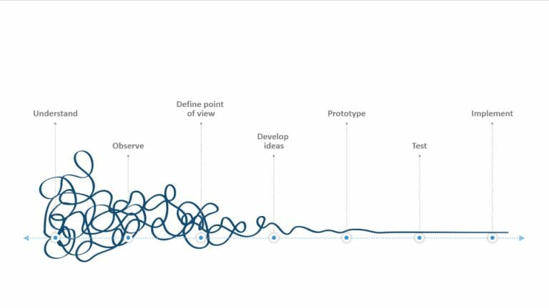
To stick to the time limit, but still communicate all the important points, you need a common thread. Think about how you want to build the structure. Here’s a structure you can use as a guideline:
Situation: Describe the current situation. Stick to facts known to the audience.
Problem: Explain the problem that has occurred. Describe what effects this can have. It must be clear that a solution that is relevant to the audience needs to be found.
Solution: Present the solution. Make it clear that this can positively influence the consequences of the problem. Briefly address what the solution needs to do.
What comes next: Stay specific and provide suggestions. Now it is the company’s turn to act.
- The 60-minute presentation: Status report
An hour gives you the opportunity to deliver your presentation in much greater detail. That said, you should still stick to the principle of less is more. Even though you have more time to present, don’t go overboard and risk losing your audience’s attention.
This structure is quite similar to the Pyramid Principle we discussed earlier. It can also be modified depending on the topic. The structure is as follows:
- Introduction
- Issue/objective
- Solution/status
- Details
- Decision
- Next steps
The introduction provides an overview of the topic. Frame your presentation in a way that the audience will understand.
This is followed by the issue or objective. At this point, you recap why you’re presenting and clarify the key question.
Next comes the solution or status (3). Present the solution to the key question. Make clear that your proposal will solve the problem. Depending on time, you can add details or keep them ready for follow-up questions.
In the details section, provide a comprehensive description of your solution (4). Make sure it’s well structured – put it down on paper first. Cover quality, costs, resources, time and all other important aspects. Make this section as clear as possible.
The decision/next steps slides follow. At this point, remind your audience again of the problem (2) and its solution (3). Now it is up to your clients to make a decision. The next steps are to give an outlook on how the subsequent actions could proceed (in terms of time/resources, etc.).
- 60-minute presentation: Comparing options
If want to compare options, you can use the following structure in your 60-minute presentation:
- Provide an overview of the topic and context for your audience.
- There is a problem or a challenge.
- First, describe the negative impact of the issue that has arisen. Don’t present solutions yet.
- If you had an objective, explain it briefly. Address the person who gave the assignment. Describe your approach to investigating the problem. Don’t present any solutions yet.
- Describe the first option. Really go into detail and consider all factors, such as time, money, resources, etc. Highlight all factors and implications. Keep this part neutral and avoid giving your personal opinion.
- Describe the second and potential third option, as in point 3. Again, avoid giving any kind of personal opinion.
- Compare the options with each other. This is the main work and core point of your presentation. Conduct the comparison on one slide so that the points are clear and can be evaluated at the same time. Be prepared for follow-up questions.
- Now you can make your recommendation for an option. Justify it in detail.
- At the end of your consulting presentation, combine the problem or objective with your recommended option as a solution.
Example: McKinsey 7-S framework
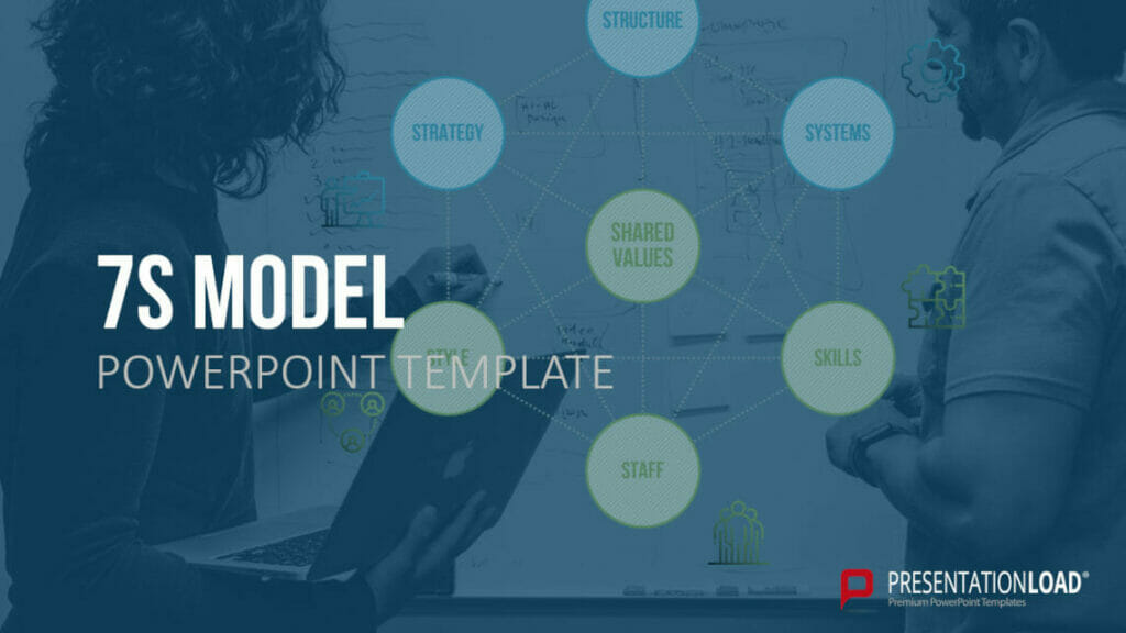
The 7-S framework was created in 1980 by McKinsey management consultants. It represents seven core elements that are fundamental to a company, and which can be included in the consulting process.Many management consultants use the model as a starting point for their consulting presentation.
The seven elements are:
- Strategy: The company’s strategy must deliver a competitive advantage over rivals.
- Structure: How the company is organized, and departments structured.
- Systems: The company’s activities and processes that are used by employees daily.
- Skills: The competencies of employees (corporate skills).
- Staff: Company employees, their abilities and demographics.
- Style/culture: Corporate culture as defined by management.
- Shared values/superordinate goals: The values and standards that are shared throughout the company (mission statement, corporate identity).
Strategy, structure and systems are the hard factors. The remaining elements are soft factors that are easier to define and present.
Feel free to use PresentationLoad’s professionally designed 7S model for your next consulting presentation!

Here are some things to watch out for and avoid in your consulting presentation
- Creating presentations from the wrong perspective: Stay client-centric. Avoid any “I” phrases, even when the presentation was written by you. It’s not about you but about providing advice to the company that has hired you. Put your audience and their needs at the forefront of your presentation.
- Misunderstand and mischaracterize presentation objectives: Think carefully during your preparation about why you’ve been hired. What is the purpose and goal of the presentation? Are you simply expected to share information as facts, or are you expected to dive deeper and make recommendations?
- Not use enough impactful headings: Go for clear, punchy headers. Optimally, you should also use action titles. For tips, see our article, Action Titles in PowerPoint. Avoid long-winded headings that go beyond two lines. Stick to a length of about 6-10 words.
- Leave open-ended questions: Use concise text that covers all key information. Answer the “so what” question, that is, keep the purpose of the presentation in mind, what does XY mean to your client? What is the significance of the projected numbers?
- A lack of authority and technical preparation: Your client has entrusted you with their problem. You need to be sure of what you’re talking about and stay as calm and poised as possible. Speak freely whenever possible and, most importantly, without making mistakes. Consider all technical obstacles beforehand. Make sure your slides are crisp and easy to read.
- A weak ending: Avoid using “Thank you for your attention” at the end of your presentation. Rather, end your presentation with an interactive, open-ended question to your audience. Or give an alternative outlook on the future. You can find more ideas in our article on how to end your presentation.
Conclusion: Create a professional consulting presentation
The key to successful presentations lies in the right preparation and dedicating enough time to work out all the important points. Take our tips to heart for your next consulting presentation assignment. In no time at all, you’ll see a difference in the quality of your PowerPoint presentation.
Do you have questions about consulting presentations or PowerPoint in general? Please don’t hesitate to get in touch at [email protected]. We’ll be happy to help you!
Are you looking for visually impressive and professionally designed slide templates? Feel free to have a look around our shop. We have countless templates on a wide variety of (business) topics for you to download as ready-made slides. Take a look around today! ► To the shop
These articles might also interest you:


