8 Tips for a Winning Company Presentation
A company presentation is a vital tool for management and sales departments. This type of presentation plays a huge part in promoting the corporate brand – it’s layout and structure need to be professional and convincing. In this article, we’ll show you what goes into a successful company presentation.
Your company presentation in PowerPoint
Today’s dynamic market requires companies to adapt and continually seek out new partnerships and clients. Creating a compelling and versatile presentation of products and services is essential. Here are 8 useful tips for designing your company presentation in PowerPoint.
First impressions are everything – and that goes for company presentations, too. It takes people a fraction of a second to form an initial opinion and all too often, that initial opinion is hard to change. This makes it all the more important to set the right tone at introductory meetings.
At face value, a company presentation serves the simple purpose of presenting a company in the best possible light. You want to list key figures and detail services, but you also want to convey emotions and mission statements. The other party wants to learn about who you are.
Your company presentation needs to be tailored to your brand, your business, your products and your services. Although there is no ideal blueprint for a company presentation, there are principles and rules to guide the process.

Tip 1: Preparation and design: The first impression counts
A company presentation is often the first step in connecting with important stakeholders. It lays the groundwork for further discussions and meetings and other objectives, such as closing a contract, establishing a partnership or inviting the client to a follow-up meeting.
You don’t get a second chance to make a first impression and your company presentation is no exception to this rule. To truly be effective, every presentation needs a professional design. And that starts with the corporate design (CD).
Take a look at your existing company presentation. Is it consistent with your CD?
If not, you need to tailor the font, color scheme and visual language to your corporate identity. Establishing a consistent and meaningful design will help you make a lasting impression on potential clients and partners.
In addition, high-quality images are a must. Professional preparation and great design mean being able to win over even the most critical managing director or the most demanding customers.
✔ Keep the design of your company presentation timeless, elegant and appealing. Avoid overwhelming your audience with cluttered slides and too many bells and whistles. Clean and modern flat design (a large selection of graphics, icons and diagrams can be found here),as well as isometric design (found here) are currently on trend.
Tip 2: The 20-minute rule. Your audience’s time is precious!
Most executives and leader are pressed for time and as a result, attention spans can be short. For this very reason, keep your company presentation short:
Spend a maximum of 20 to 25 minutes on the introduction section (“about us”). Then it’s time to get to the point and present your business concept, specific offer, products and/or services in detail. Better yet, keep you presentation short and start a dialogue.
Studies have proven that during a presentation, attention levels drop sharply after just 15 minutes. Your audience will be grateful that you value their time. In most cases, they already know more about your company than you think.

Tip 3: Structure: What belongs in a professional company presentation?
The art of a successful company presentation is, among other things, to condense the most important content of your business plan (business model, market, strategy, finances, etc.) onto a few slides. But it’s even more important to know which facts are truly relevant to your target audience and which are not.
1. Always start by answering the most important W questions:
Who? Contacts, management, staff, partner companies
What? Services, products, etc.
Where? Locations, industries/markets, business areas
How? Goal, vision, mission statement
Why? Advantages for new clients or partner companies
Emphasize the “What?” and ” Why?” of your presentation; this is what your audience will be most interested in.
2. Competition is fierce. Most markets are flooded with competitors and attractive alternatives. That’s why unique selling propositions and individual advantages are so important. What makes you special? Why are you better at meeting the needs of your audience?
3. Always include references from satisfied clients and customers. Concrete references help your audience better understand why your services or products are the right choice.
4. Call-to-action: The last slide of your PowerPoint presentation should motivate your audience to act. You’ve presented your company in detail and with conviction – now you want a reaction from the audience. You can formulate this call to action in more general phrases along the lines of “Let’s get it done!” or “Let’s go!”, package it as a targeted question about the content or use it as a prompt for follow-up contact.

Tip 4: Highlight benefits to your target audience
Knowledge about your target group is power. The first question your audience will ask themselves when you give a presentation is, “How will I benefit from this?” Here are some questions that will help you tailor your content to your audience:
- What are the driving factors for purchasing/collaborating?
- How much prior knowledge about your company is available?
- What follow-up questions are you likely to receive?
- What key messages do you want to convey in your presentation?
- What is your unique selling point (USP) and how do you differ from your competitors? Check out this blog article for more information.
- What kind of design and layout is right for your (business) presentation?
- Storytelling: How do you best get your story across?
- Is the company history really interesting to your audience? Maybe it’s the new innovative solutions you’re about to launch that will deliver real added value?
- Does it matter how many locations and employees you have or is how your customer service process works more important?
A good start to developing your presentation is a team brainstorming session followed by a workshop with key decision-makers from management, marketing, and sales. You can also bring editors, copywriters or a specialized agency on board.
Tip 5: Convince with more than just text
The presentation design needs to be just as convincing as the content. Most presentations we see consist of 70-80% text. But bullet points and sprawling text alone aren’t enough to make an impact.
The design process begins when you stop focusing on writing statements and start creating a presentation that supports your content visually. Here’s a good rule of thumb: 50% of your slide’s area should be text, 50% should be images, graphs and charts.
Obviously, you don’t have to follow this rigidly on all slides, but presentations with rich visual content are always a success. The most important thing is to keep written content short – keywords and short sentences are usually enough.
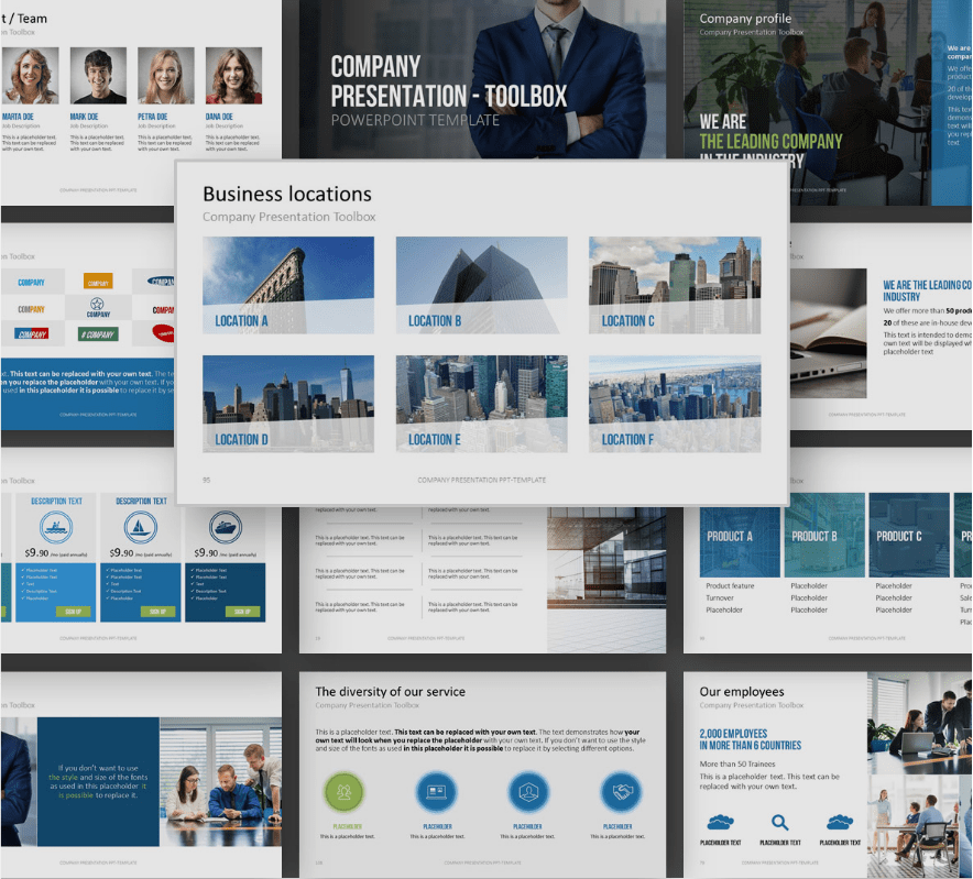
The following slides (screenshots from our Company Presentation Toolbox) provide vivid examples of layouts and designs.

If you’re pressed for time or need some professional design inspiration, check out our PowerPoint templates. Or ask a graphic designer or a professional PowerPoint or presentation agency like PresentationLoad for support.
Tip 6: The customer is king: Give them what they want
Before you start your presentation, ask your audience what information they need. Are they familiar with your company? Have they already gone to your website for information? Knowing this might help you tailor it more to your audience’s needs by editing or even completely omitting sections of your presentation. The key is to remain flexible while presenting and only include what is really relevant to your audience.
The first step is to make sure your presentation is completely up to date. A slide master is the easiest way to make any universal changes to your presentation, update key figures, contact information, etc., without sacrificing formatting or layout.
Even in a completely updated presentation, you may find there’s information that just isn’t relevant to your target audience. PowerPoint helps you with this by providing a quick and easy option to hide slides. In the thumbnail pane, right-click the slide you want to hide and select Hide Slide. You can also hide multiple slides by holding down the Ctrl key, clicking on them and then selecting Hide Slide with a right-click. The hidden slides will now appear greyed out. To reverse this option, simply click Hide Slide again and you slides will be visible.
Another technique to make your PowerPoint company presentation more flexible and interactive is to use hyperlinks. For example, you could hyperlink all the titles of individual sections on your agenda slide so that you can jump from the agenda slide directly to the relevant section with a simple click. This also allows you to respond dynamically to your audience’s reactions or interests.
Pro tip: Use your company logo as a home button. Adding a small logo to the corner of each slide not only strengthens your branding, but also allows you to add a hyperlink to the agenda slide. Click on the logo and you’re back to your PowerPoint presentation overview.
Tip 7: Present like a pro
A company presentation lives and dies by its delivery. Even a perfect presentation is of little value if the delivery isn’t convincing. As a presenter, you need to communicate the passion and enthusiasm you feel for your brand through your presentation.
But don’t go overboard! Be authentic. If you can do this, your company presentation will not only reinforce your company’s positive image but will also excite your audience.
Arouse emotions by using images that speak to your audience. Involve your audience by starting with words such as “Imagine…”. Focus less on “we” (your company) and more on “you” (your audience). These techniques will help you open the door to your audience’s subconscious – which is where most decisions are made.
✔ Leave enough time to rehearse your presentation.
Ask your colleagues if they would be willing to serve as a test audience and give feedback on your presentation.

Tip 8: Post-presentation best practice
Always prepare a ready-to-email format of your presentation. When your customers and partners are impressed, they’ more likely to ask for a digital copy.
Never send your presentation as a PowerPoint file; always send it as a PDF to preserve its formatting and layout. Be sure to pay attention to the file size, too. A company presentation in PDF format should be no larger than about 3MB. An email attachment containing a 30MB company presentation will come across as anything but professional. There’s also a risk that the email won’t even reach the recipient’s inbox due to a limited attachment size.
✔ Create your company presentation PDF before you present.
This way, you can offer it as a digital copy directly after the presentation.
Win customers with your company presentation
On just a few slides, your company presentation summarizes all the pertinent facts and ideas with which you want to convince your audience. This makes it all the more important to truly understand your audience before you start designing your presentation.
The first impression counts – adhering to your corporate design will elevate your presentation to a higher, more professional level. Be concise and to the point and highlight the benefits your audience will derive from working with you and your company. A modern presentation is designed with a 50:50 ratio of text to images; avoid too much text and unnecessary facts.
As the presenter, you represent your company. That’s why it’s especially important to be flexible and provide your audience with the information that matters most to them.
The aim of this blog post is to provide you with a general idea of how to create a practical and convincing company presentation in PowerPoint. These tips are based on years of proven professional expertise.
Need help creating an even better company presentation?
Feel free to post a comment here or contact me directly by sending an email to [email protected].
I’d be happy to answer your questions or, along with my team, help you with the concept, structure, content and design of your company presentations. It can really help to have someone with a different perspective take a look at your presentations.
We have been creating PowerPoint presentations for mid-sized companies and international corporations for almost 20 years. As a result, we have a wealth of experience with corporate sales and strategy presentations.
Additional services:
- Non-binding consultation for your presentations.
- Send me your presentations for review.
- Professional support with concept and design.
- Revision of your existing company presentations.
Good luck with your presentations!


