Animations and Triggers on the Slide Master: The Expert Guide!
It’s a nightmare most of us have come up against: your presentation has been fully prepared, and then you suddenly realize that something needs to be changed. But in making those changes, your presentation ends up out of balance, with images in all the wrong places, wrecking what you’d planned.
Luckily, there’s the PowerPoint slide master. This allows you to create an coherent design, with animations and triggers, letting you make changes without upsetting the apple cart. We’ve put together some tips & tricks to do with animations on the slide master below.
So what is the PowerPoint slide master?
Using the slide master lets you modify or extend your presentation without destroying the design and dynamics of your slides, by quickly and easily defining basic elements in a uniform way.
We’ve gone into this in detail in our article “PowerPoint Slide Master“.
Animations in the slide master – here’s how!
The PowerPoint slide master is not just great for maintaining a uniform design, but also for setting up repeating animations. If you want to set up repeating triggers or animations, it makes no sense to add them to all slides individually. Using the slide master, you only have to set things up once; it’s then automatic for all your slides.
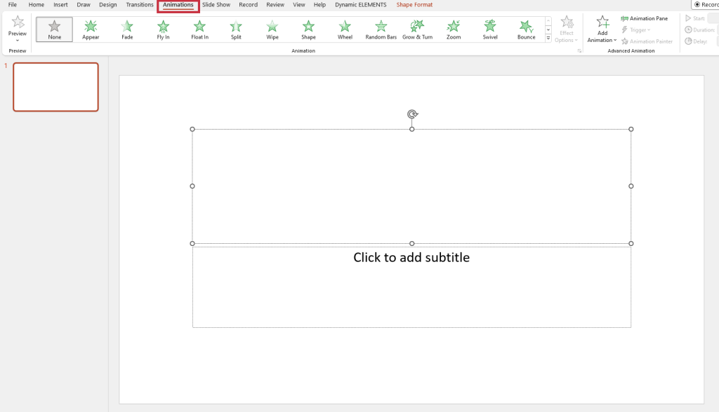
We’re going to use text placeholders as an example. The pictures below show an empty slide with the placeholders, first in normal view, and then the slide master template.
If you click on the frame of the textbox in normal view, the animation menu pops up, from which you can select an effect.
In slide master view, the individual effect levels are displayed directly on the frame. The five digits represent five different text levels. In the animation menu, on the other hand, you only see one line; the other levels only appear when you click on the respective level.
If you close the slide master at this point, the animation you selected before will appear in the animation menu on the right in normal view, which will now also contains “Master“. Five lines of text have been inserted in the placeholder on the slide. In the animation menu, you can see that the “Master” is missing. The mouse icon at the left represents “On click“.
The animations run in the sequence shown in the animation menu. Clicking first animates the slide master, then the text box on the slide.
Caution: When selecting placeholders in the slide master, it is easy to make mistakes. If you want animation for all slides including all slide layouts, you need to select the top slide in the slide master.
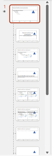
If you select the master slide that is highlighted when you go from any slide to the slide master, the effects will also be applied only to the slides that are assigned to that master. You can see the difference in the Animation Area menu. Here you can see that an animation has been set up on the top master slide. Below that there is another effect for one of the layout slide masters. If you now present your slides in presentation mode, the animation will unroll as follows:
#1: First, triggered by a click, the effects of the master slide run.
#2: Then the selected effects of the individual slide layout run.
Attention: If you have selected two identical text boxes, the animation of the texts in the text box on the slide will also run twice (one after the other).
In the next screenshot, only the text box in the slide master layout has been animated.
Problems with animations in the slide master
Using animations in the slide master requires a lot of care. Once done, it can be very difficult to edit or remove wrongly inserted effects. It is also essential to note that this is even more complicated if you’ve inserted your own objects on the slide master as well, and animated them.
In that case, you won’t see the animations of these objects in the animation area in normal view, and you won’t see when and how each animation runs in the slide master.
Example:
To clarify, here’s an example. A triangle has been inserted on the master slide. You can see that this triangle appears on all the slide master slides.
The triangle was then edited with the “Float in” and “Rotate” effects and set to run “On Click“. In the Animation panel menu, the first effect of the text placeholder is visible at the top.
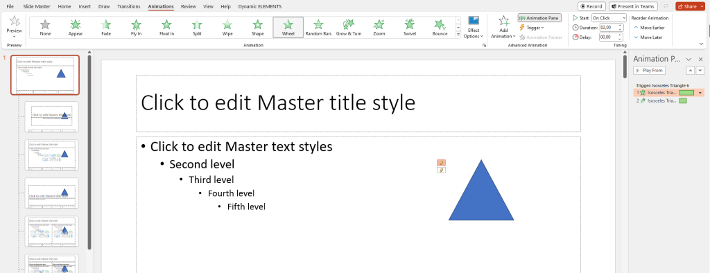
The problem here is that in the animation area only the animation of the placeholder is visible once you close the slide master. You can no longer see both of the effects applied to the triangle.
Animations on the slide master – our tips
#1: Less is more
If you set up an animation on the slide master, it will initially run every time a slide starts. If you’ve also applied slide transitions, the constant movement can irritate your audience.
The way the effect plays out also plays an important role: animated clips, for example, can come across as agitated in your presentation, or shapes that move dimly in the background have a disturbing effect. We recommend that you watch your entire presentation in original size, if possible in the screening room, carefully. You’ll soon see whether your presentation is ready, and can make any changes needed.
#2: Shortcuts
To get to the master view, you usually have to go via the menu. This requires a few clicks and takes more time than working with shortcuts. A far quicker way is the shortcut of pressing Shift and clicking on the normal view icon at the bottom right of the status bar.
Another click on the button will take you back to normal view.
We’ve gone into useful keyboard shortcuts in this blog article.
#3: Use triggers
A trigger, as you probably know, can be any object that explicitly triggers an effect. For more about triggers, see this blog post.
If you want to combine effects from the slide master with animations that run on the slide, you can use PowerPoint triggers. The best way to do this is to first create all the effects on the slide, then copy the animations for the slide master. This ensures that the sequence can be precisely timed.
Alternatively, you can copy an existing master and then modify it to meet your needs. You can then modify this master for test runs without editing the original master.
Triggers on the slide master – the nitty-gritty
Many PowerPoint users don’t realize that trigger fields located on the slide master can also be triggered when in normal presentation mode.
Attention: You need to click on various objects on the master for this, so it is important that they are accessible. This means that the objects must not just be visible, but:
– not overlaid by other elements on the master
– not hidden by elements on the slide (in normal view).
– not be behind placeholders of any kind.
While the first two points are obvious, the third point can be a bit tricky. On the slide master, there is no option to “turn animations on or off”. However, we have found a way to give you this choice.
Normally, the animations on each slide run in the order defined on the master slide. By default, there are no exceptions. Using a trigger, though, you can create an individual solution.
Being able to react fast and freely while presenting is essential when circumstances change:
#1: You’ve slightly misjudged the time needed for your presentation and decide during the presentation that the main animation of the texts can‘t be clicked through individually. You can find tips on how to manage your presentation time properly in our article “Time management“.
#2: Complicated and text-intensive slides are taking more time than in rehearsal.
#3: Alternatively, you can choose to use your trigger to click through individual lines of text on the slides at any time.
#4: This allows you to manage your time effectively and adapt to whatever situation arises.
Here’s how to do this:
Open the slide master of the slide with the text box and select Title and content layout in the master area. Then right-click on the slide and select Duplicate layout. From this point on, you will be working with two slide masters, each of which you can select with buttons on the master.
In this example, we have added a shape in the new master marked without animation so that this can be more clearly understood.
On the other master slide, insert two shapes as buttons. Here we’ve inserted a green triangle and a red arrow. Tip: Place simple rectangles at the top and bottom corners. Fill them with 100% transparency so that only you can see the buttons.
In the next step, we have put a blue triangle with animation on the slide. A style sheet pops up showing the animation option Fly in > from left. Select the effect and then choose Animations > Trigger > On Click > Right Arrow.
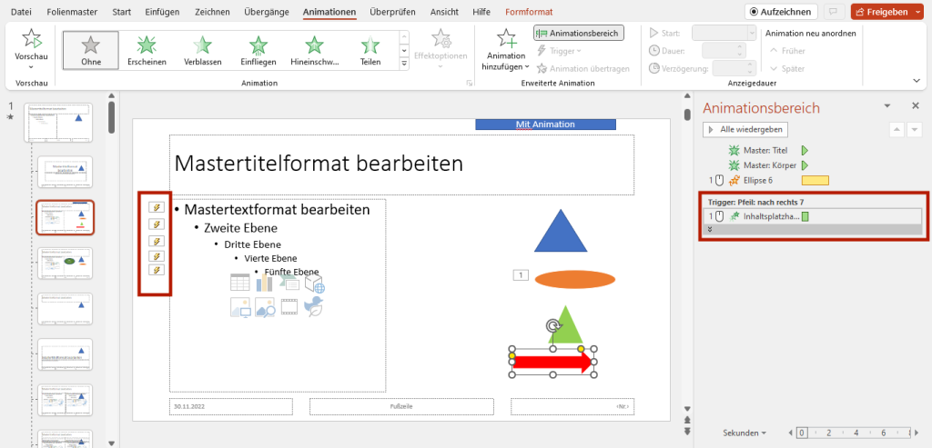
You can see five lightning bolts on the left of the five text layers: this means that the animation of the text won’t start until you click on the blue triangle. Now click on the green triangle and provide this with a hyperlink to the next slide. If you click on the triangle in presentation mode, the next slide won’t be linked, but will appear in normal presentation mode. In the next step, close the slide master so that you are back in normal view.
Now select all slides with the layout without animation in the overview and right-click to choose Hide slide. All the slide numbers of the hidden slides will now appear crossed out. In normal presentation mode, these hidden slides will not be displayed.
Running the presentation
So once you’ve done the above:
#1: You get to a slide in your presentation with lots of lines of text.
#2: Your audience won’t see anything but the headline.
#3: As the presenter, you can now decide whether you want to show and explain the other lines individually, by clicking on the blue triangle.
#4: If you decide you want all the lines of text to appear at the same time, however, click on the shape with the hyperlink to the next slide.
Although at first glance this seems to involve a lot of effort, it is quickly done and can be very useful. There is also another way of doing this, which we will go into below. It may seem even more confusing at first, but since many PowerPoint users find it useful, we couldn’t leave it out.
Triggers via text boxes on the slide master
With this method, you don’t copy the entire slide into the slide master, but select the text box on the corresponding master slide and duplicate just the text box. We have colored the text of these boxes red in the screenshots to distinguish them.
#1: Place the new text box exactly above the slide that already exists on the master slide. #2: Now create two shapes, such as rectangles, and place them at the edge; they will serve as trigger fields. They are colored red and black in the screenshot to match the text boxes
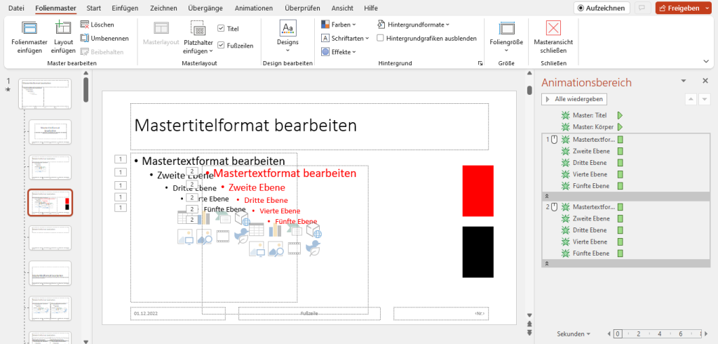
#3: Apply the animation you want to the new, red text box and select the corresponding (red) rectangle as the trigger field.
#4: Next, click on Effect options > Text animation/ Group text > as single object.
#5: Do the same with the second text box and then close the slide master. In normal view, you will now see that there are two placeholders for the text box.
#6: This means that you have to copy each text twice, identically, into each text box. This overlapping of texts can be a bit confusing during editing, since you have to make each correction twice.
Running the presentation:
The presentation will run similarly to our first example:
#1: You get to a slide in your presentation with lots of lines of text.
#2: Your audience initially sees nothing but the headline.
#3: You can now decide if you want to show and explain all the lines individually; if so, click on the black rectangle.
#4: If you want all the texts to appear at the same time, though, click on the red rectangle.
The advantage of this way of doing things is that you have fewer slide masters, so making your choice may seem more obvious. It’s one of those things where each user has to find out for themselves which method works best for them.
To sum up – coherent and visually interesting presentations thanks to triggers in the slide master!
Even if creating triggers in the slide master seems like a lot of work at first glance, it guarantees more attention from your audience, and better comprehension. Try the different methods, and find out which one works best for you.
If you have any questions about slide masters and animations, or indeed PowerPoint in general, don’t hesitate to get in touch at [email protected]. We’re always happy to help!
Looking for professionally designed slide templates for your presentation? Feel free to take a look around our store. We have a wide range of slides for you to download across a multitude of business topics ►Shop
If you’d like to save time and effort and have a slide master professionally created, feel free to get in touch with our agency. Our experienced designers create a slide master for you exactly as you wish. ►Agency
You might also be interested in the following articles:


