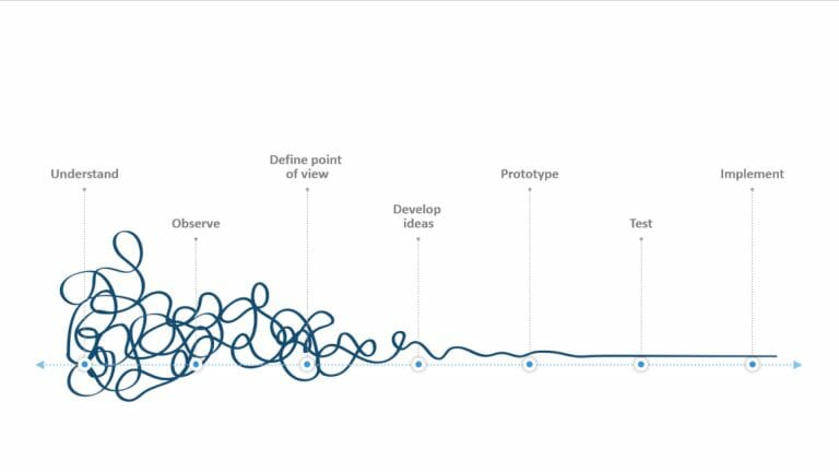
Using Contrasts in PowerPoint: 3 Different Types of Contrasts with Tips and Tricks!
The goal of your PowerPoint presentation is always to skillfully convey your content to the audience. Surely, you are aware that the design of your slides plays an essential role in this. Visual aspects should always be well thought out.
Consider using contrasts in PowerPoint effectively. With the right implementation, you can skillfully emphasize important elements and make a strong impact. We will show you the different types of contrasts and how to use them effectively.
What are Contrasts?
In visual design, contrasts refer to distinct differences between various elements. In PowerPoint presentations, different types of contrasts can occur, such as differences in colors, sizes, fonts, shapes, or movements.
Why are contrasts in PowerPoint that important?
When you strategically incorporate contrasts into your presentations, they significantly contribute to improving the visual impact and comprehensibility of your content. Contrasts create distinct differences between elements such as colors, sizes, shapes, and fonts, directing the audience’s eyes to important information.
With contrasts, you can also establish clear hierarchies and structure your content effectively. Additionally, they enhance the readability of texts and give your presentation an aesthetic and professional touch.
Examples: A well-chosen contrast between text and background enhances readability, while a size contrast helps highlight important elements and establish visual hierarchies. Color contrasts can evoke emotional responses and support the message of the presentation.
Three types of contrasts in PowerPoint
Fundamentally, three main types of contrasts can be distinguished:
- Color Contrast: Refers to differences between colors and can direct attention to important information or distinguish various content areas from each other.
- Size Contrast: Involves differences in the size of elements and allows you to highlight important elements or establish visual hierarchies.
- Font Contrast: Involves combining different fonts and font sizes to achieve better readability and a clear visual structure.
- Other Types of Contrast: These include shape contrast, texture contrast, and motion contrast, each producing different visual effects.
How can you skillfully implement these contrasts in PowerPoint? We’ll show you now.
The Color Contrast
When it comes to color contrast, there are several aspects to consider. For a good color contrast, ensure that you choose colors that harmonize well together and provide clear differentiation between various elements.
Tip: Use colors from the color wheel to create contrasts, such as combining complementary colors.
When editing your backgrounds, ensure an appropriate contrast between background and text colors. Light text on a dark background or vice versa allows for clear separation and improved readability. It is advisable to choose contrasting colors without becoming too bright or straining to the eyes.
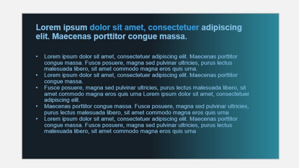
Consider these color combinations for selection:
- Warm-Cold Contrast – Combination of warm and cold colors
- Monochromatic-Polychromatic Contrast – Combination of polychromatic and monochromatic images
- Light-Dark Contrast – Combination of intense and lightened color tones
- Quantity Contrast – Combination of large and small color elements
Caution: Consider color blindness as well when making choices to ensure a more accessible presentation.
Avoid using too many different colors as it can quickly distract from the essential content. Decide in advance which colors you will use and consistently apply them in a targeted manner.
The Size Contrast
By using different sizes, you can highlight important information, headings, or key images in your presentation, creating a clear visual hierarchy that makes the main message of the presentation more accessible. Through the use of various sizes, you can skillfully develop hierarchies and emphasize important aspects.
Example: Headings, main points, etc., can be highlighted as significant using larger elements. Smaller elements can support these main points and complement details.
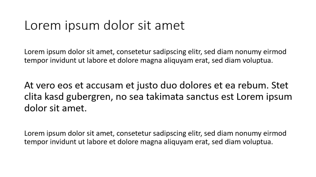
Caution: It is essential not to use too many elements of different sizes to avoid cluttered visuals and instead focus on highlighting the essentials.
Tip: Use size contrasts to create a connection between text and images. For instance, if a statement or heading needs visual emphasis, it can be presented in combination with an image or graphic that is larger than the rest of the content. This establishes a strong visual connection, anchoring the message more effectively in the audience’s memory.
The Font Contrast
With font contrast, you influence the readability and visual impact of your PowerPoint presentation. Choose only appropriate font styles that match the message and theme of your presentation (tips on this are available in the article “Fonts in PowerPoint”).
When using different font styles (e.g., for headings, body text, and bullet points), you create clear hierarchies. Ensure that your font sizes provide adequate readability.
It is also crucial to have an effective font-color contrast to ensure that the text stands out clearly from the background. If the background is dark, the text should be displayed in a light color, and vice versa. This improves the readability of text content, allowing the audience to grasp the information more easily (see Color Contrast).
To create a clear visual distinction between headings and body text, you can employ font contrast. Headings should be larger and more prominent than the body text to establish a clear visual difference. This way, the main themes of the presentation can be recognized more quickly.
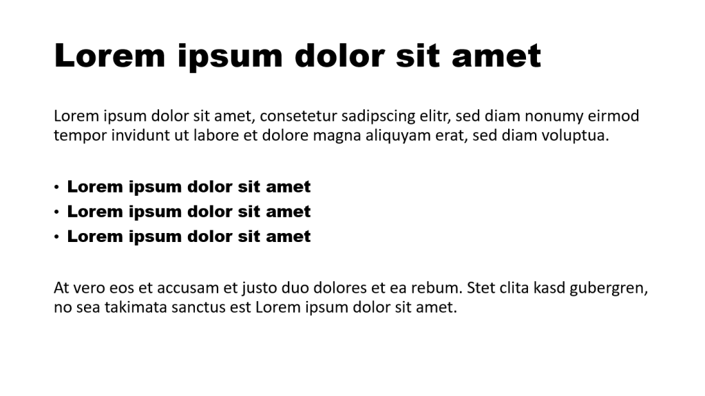
Contrasts in Slide Elements
Images and Contrast
Images speak louder than words, and the same applies to presentations. Therefore, never forego enhancing your statements with images. When using images, pay attention to contrasts as well. Additionally, you can create contrasts through the placement of images. By linking them sensibly with the content of the slide, you ensure an engaging and contrast-rich presentation that impresses the audience and effectively conveys the message.
The selected images should be clear and easily recognizable to enable clear communication and enhance the contrast with other presentation elements. In some cases, you may need to edit the images to adjust the visual contrast. For example, you can adjust brightness, contrast, and sharpness.
Caution: When editing, make sure the images still look realistic and appealing without appearing overly exaggerated.
Using Contrasts in PowerPoint for Data Visualization
Diagrams and charts are essential when seeking an effective way to present complex data vividly. When using diagrams and charts in a presentation, it is often necessary to highlight specific data points or results. This can be achieved through different colors, markers, or labels. Create contrasts in this regard:
Use colors deliberately to clearly convey the information. Choose contrasting colors to make the distinction between data categories visually apparent.
Contrasts in PowerPoint Animations
Using animations or other interactive elements keeps the audience engaged. Even in animations, you can consciously pay attention to contrasts. Skillfully using contrasts in animations increases visual dynamics and livens up the presentation.
You can find many ideas for animations and interactive elements in our blogs “Animations in PowerPoint” and “Interactive Presentations“.
For instance, utilize effective object fade-ins and fade-outs. These create a clear visual contrast between the state before and after the animation. A gentle fade-in can draw the audience’s attention to the element, while an abrupt fade-out signals a significant change. There are numerous animation options available for contrasts in PowerPoint:

Another approach is using animated size contrasts. Here, you skillfully direct the focus to specific elements in the presentation. Animated size contrasts create visual focal points and thus support the communication of your message.
For example, a crucial text section or a key image can be enlarged during the fade-in to emphasize its importance.
Also, use colors as contrasts in animations. By using contrasting colors, you create a vibrant and dynamic representation (e.g., color changes, gradients, striking colors), adding an appealing visual aesthetic to the PowerPoint presentation.
What to Consider When Using Contrasts
- Consistency in the Use of Contrasts
When using contrasts, ensure that they are applied consistently throughout the entire presentation. This includes using similar color palettes, font sizes, and styles, as well as size contrasts for similar elements.
Maintaining consistent contrast usage creates a harmonious and professional overall look and avoids visual clutter or confusion for the audience.
- Moderation in Using Contrasts
Although contrasts have a strong visual impact, it’s essential to use them with moderation and thoughtfulness. Too many contrasts can overwhelm the presentation and distract from the actual content.
Focus on using contrasts for relevant elements that need to be highlighted. Less is often more, and a targeted use of contrasts leads to a clearer and more impactful presentation of information.
Extra Tip: Black and White Contrasts in PowerPoint
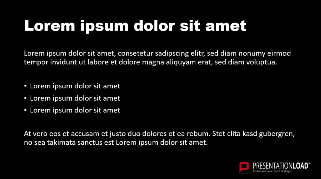
One of the most well-known contrasts is the black and white contrast. When creating a presentation, the question often arises whether to use a white background with black text or a black background with white text.
The convention is to read dark text on a light background. A black background is often associated with a heavy mood, but that doesn’t have to be the case.
A black background is equally suitable as a background as a white one. After all, black clearly highlights other colors and makes contrasts highly visible. With a dark background, you can, for example, emphasize your company logos. Additionally, black adds a touch of elegance and variety to your presentations, which often feature the standard white background.
If you choose a dark background, keep in mind that white or light text may be more challenging to read. Also, using bold formatting with white or light text can sometimes be risky, as the letters may blend together and become difficult to read.
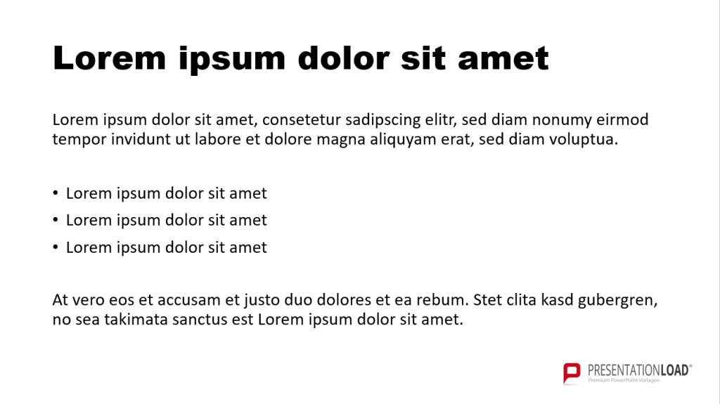
An advantage of using a white or light background is that you have the opportunity to use a wider range of colors. Particularly saturated, bright colors appear more contrasting on a white slide background and may get lost on dark backgrounds.
In contrast, unsaturated and pastel colors are better visible on a black background. Therefore, consider the color palette you want to use for your presentation and adjust it accordingly based on your background.
The same applies to the integration of graphics, icons, etc. A white or light background often works better in such cases. Often, these elements have a white frame on a dark background, which can be challenging to remove without proficient editing skills.
Black or white? Our recommendation: Both options work, but the choice depends on your presentation design and your industry. White tends to represent clarity, structure, and purity, making slides with a white background a good choice for academic and scientific presentations. Black, on the other hand, exudes elegance and modernity, making it a more fitting trend for business, marketing, and corporate presentations.
Conclusion: Skillfully Using Contrasts in PowerPoint
Contrasts are versatile and can be used effectively in presentations. Use the contrasts that suit your content and skillfully emphasize your messages. Give it a try today.
If you have any questions about contrasts in PowerPoint, feel free to contact us at [email protected]. We’re here to help!
Are you looking for visually supportive and professionally designed slide templates? Take a look at our shop. We have numerous slides available for download on various (business) topics. Check it out today! ► Shop
You may also be interested in these articles:


