All Caps in Presentations? Don’t Rule Them Out!
By all caps we mean ALL CAPS. One of the biggest questions in text design and layout is: Why is all-caps text such a popular option for emphasizing important points in presentations?
Unfortunately, all caps are often overused – so much so, that they’ve lost a lot of their impact. But what exactly is so problematic about all caps in presentations and when can it be useful? Here are some answers.
Why the choice of the right font and font size is important
The selection of the appropriate font and typography plays a crucial role in the design of presentations. A well-chosen font not only adds aesthetics but also influences the readability and impact of the content.
When choosing a font, it is essential to opt for a clear and easily readable font that remains legible even at larger distances. Sans-serif fonts like Arial or Helvetica are often a good choice for presentations as they convey a modern and professional appearance.
Typography should be consistent and consider different font sizes and formatting for headings and body text to visually support the hierarchy of content.
Colors and contrasts also play a significant role in presentation design, especially when combined with capital letters. It is crucial that the background and font color offer sufficient contrast to ensure the text is easily readable.
Poorly chosen color combinations can hinder readability and make it challenging for the audience to grasp information quickly. It is recommended to use light text on a dark background or vice versa to achieve a clear contrast and improve readability.
Read more about finding the right font in our blog “PowerPoint Fonts“.
All caps in PowerPoint can be problematic
In PowerPoint presentations, the font size and style should never distract from the content but instead, reinforce it.
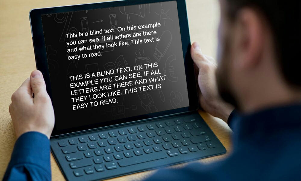
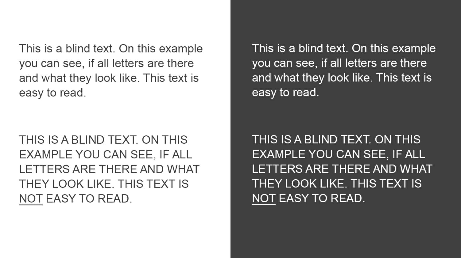
All caps can be really effective for short slide titles that introduce a topic – they help focus the audience’s attention. Never use them in longer text passages. A paragraph written in all caps is really hard to read.

The evolution of typesetting
Believe it or not, but all caps didn’t originate with social media shouting– they were first seen in the 8th century in text written in the Latin alphabet. All caps were a popular choice for newspaper headlines until the 1990s when the trend turned to lower-case letters. While all caps emphasize text (great for headlines), lower-case letters are easier to read.
Also, standard office programs, such as Word and PowerPoint, are not designed to handle all caps well, making this choice not a particularly user-friendly one.
Use all caps SPARINGLY in presentations
Think of all caps as a stylistic device that should be used in moderation and in the right places. It is an effective way to emphasize important terms or underline striking statements. In presentations, all caps should be limited to title slides and headings.
There are two main reasons why all caps should be avoided in presentations. On the one hand, all caps is the Internet equivalent of shouting. Overuse of all caps quickly comes across as aggressive or as the written equivalent of shouting. Secondly, all caps make text difficult to read.
What is the difference between all caps and small caps?
Small caps are small letters in the form of capital letters. They are traditionally used for text passages that need to be emphasized but would appear too aggressive in all caps. Many publications also use small caps for acronyms longer than three letters. Small caps generally appear more elegant and refined than all caps. They are also slightly wider than smaller capitals.
Readability is priority!
Using all caps too much in PowerPoint presentations comes at the expense of readability. First of all, ask yourself what you want to achieve with your chosen font. To make sure that your audience’s attention doesn’t stray, readability should be your first priority.
When we write text passages, we want them to flow and be easy to understand. Using all caps in text-heavy PowerPoint presentations has the opposite effect – your audience will have difficulty reading what you wrote, will take longer to get through the text and eventually, they’ll lose interest.

Capitalization in English – the basics
In English, words that appear at the beginning of a sentence, as well as names and proper nouns, are capitalized. Common nouns, such as process and business, as well as verbs, pronouns, conjunctions and adjectives are never capitalized. The brain is aware of these rules, making text much easier to read.
Sticking to these rules creates a comfortable flow and allows the audience to easily distinguish when a new sentence begins. Remember, your brain completes the process of recognizing words and their respective meanings within milliseconds.
Over-capitalizing words throws a wrench in this. Twist and turn it any way you like but, these basic grammar rules make text easier and faster to read.

When to use (and not use) all caps
Use all caps in PowerPoint as sparingly as you can. Using the same font size and spacing throughout your text creates a block of words that is far too homogeneous for the eye to decipher and interpret.
The disadvantages of all caps
The reader needs more time to understand the text. This is especially true if you use it for whole sentences and text passages.
- Poor legibility
- Disturbs the reading flow
- Comes across as advertising
- Convey an aggressive tone
There is an exception – slide headings
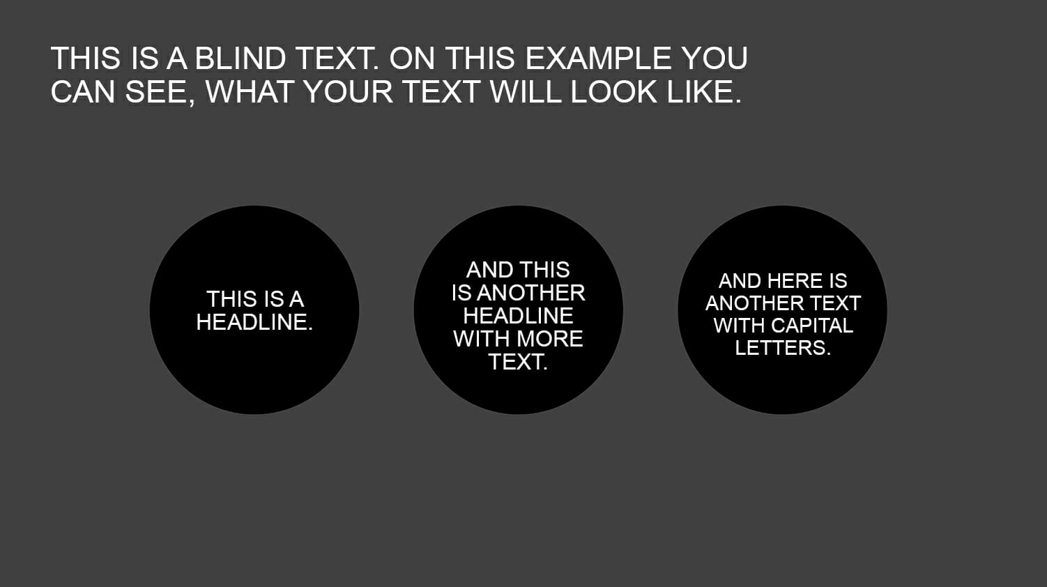
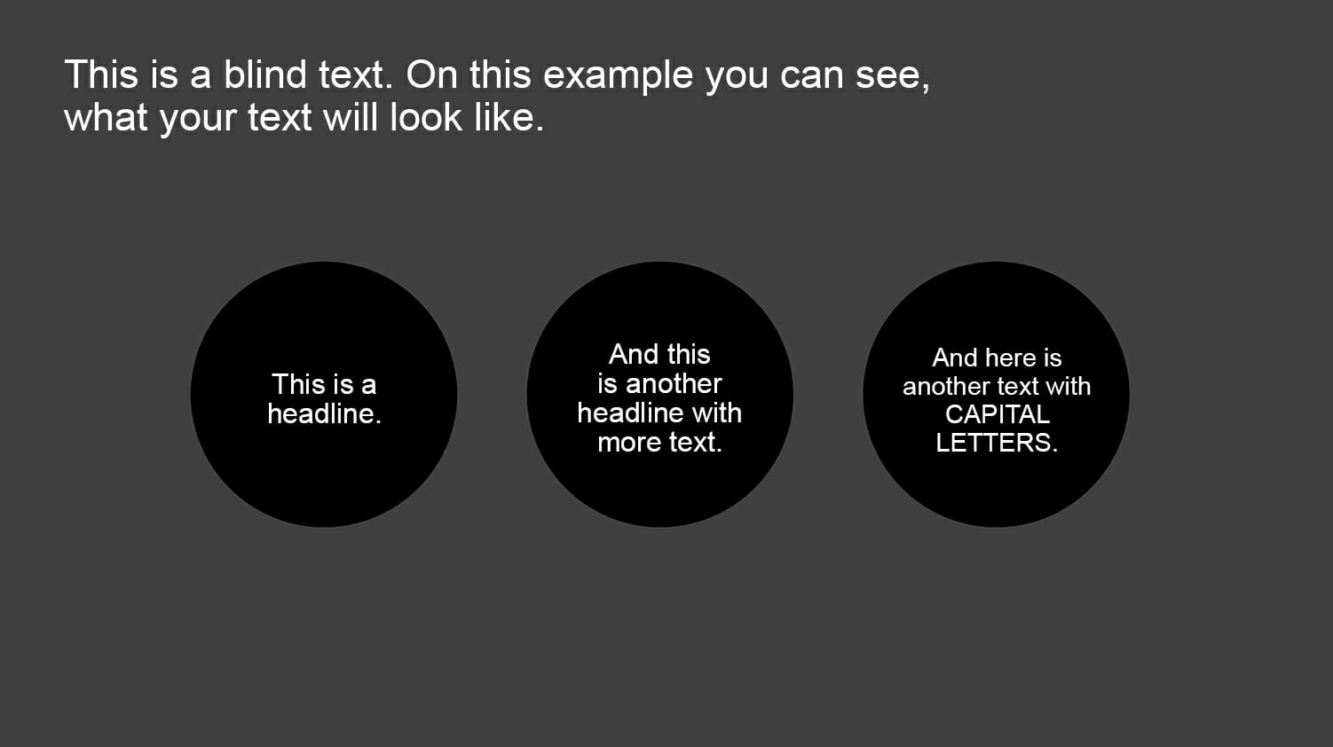
Slide or chapter headings are a special case. They should stand out from the rest of the text and, if they’re only a few words long, they won’t disrupt the reading flow. Also, each new slide should arouse the audience’s curiosity and the title of each slide is responsible for transitioning to this new topic.
In this case, the additional attention and “headline character” of all caps can have a positive effect. Just make sure to keep all-cap headings short — never longer than a few lines — otherwise they’ll lose their effect. All-cap headings can put some restrictions on the length and detail of your headings so make sure they’re a good fit with your writing style.
Alternative ideas for text highlighting
Besides capital letters, there are many other ways to emphasize important content in presentations. For instance, using shadows, borders, or highlights can visually make text elements stand out. Embedding graphics, icons, infographics, or symbols can also help effectively convey information and captivate the audience. It is important to explore creative design options to communicate messages in the presentation in an engaging and impactful manner, without compromising readability.

Conclusion: Avoid using all caps for long headings and text passages in your presentations.
Don’t make it unnecessarily difficult for your audience to read your slides. Instead, choose an elegant, modern font and size that the eye can processs quickly. Headings are an exception but here too, the use of all caps sould be considered carefully.
If you have any questions regarding capital letters or PowerPoint in general, feel free to contact us at [email protected]. We are here to assist you!
Looking for professionally designed slide templates to support your key messages? Check out our shop, where we have a wide range of slides available for download, covering various (business) topics. Browse through our selection today! ►Visit the Shop
You may also be interested in other articles:


